
project_1_ryan_hackbarth

project_1_ryan_hackbarth
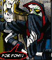
Ryan Hackbarth | drew a blank, so I put it in a frame

Re: project_1_ryan_hackbarth
I like your concept. And you used a great picture. Just one thing, I wish you'd kept the picture separate from the words. The word "paragraph", being white, kind of gets lost on a lighter part of the picture.
You could still use that picture but maybe if you give the text a frame so it has a more solid background to rest against... but other than that, solid concept.
You could still use that picture but maybe if you give the text a frame so it has a more solid background to rest against... but other than that, solid concept.
- Nathan Lundholm
-
TinaBodden
- Posts: 47
- Joined: Mon Aug 29, 2011 7:20 pm
Re: project_1_ryan_hackbarth
Looks good Ryan. I like that is more of a Ryan site instead of a TMCC website.
Tina Bodden
Tina Bodden
~Tina Bodden~

Re: project_1_ryan_hackbarth
Looks good I like how you integrated the image into the background. Some roll overs would have been cool but other than that its good.
Kyle Smith
-
brienicole

- Posts: 132
- Joined: Mon Aug 29, 2011 5:02 pm
- Location: Sparks, Nevada
Re: project_1_ryan_hackbarth
to solve the white on the lighter parts of the photo you can play with justification. It actually doesnt bother me much. I agree that some rollovers would be fun. Good teamwork buddy! 
~Brianne Porterfield
"What a crazy random happenstance!"
"What a crazy random happenstance!"

Re: project_1_ryan_hackbarth
I like the way you split up the navigation, separating the projects from the links and other areas. I may adapt something like that for my website, because I am lacking a home button, and places for site information.
My one suggestion is that your theme seems to be small… text and photo, along with minimal copy, but it would be great if the rollovers would enlarge the text, or something, to give it a sense of movement. It makes me feel like squinting, but I have old eyes.
My one suggestion is that your theme seems to be small… text and photo, along with minimal copy, but it would be great if the rollovers would enlarge the text, or something, to give it a sense of movement. It makes me feel like squinting, but I have old eyes.
Arlene Williams
Old dragons get tired but they can still flame. Beware!
Old dragons get tired but they can still flame. Beware!

Re: project_1_ryan_hackbarth
i love it! i like how you kept your text to an absolute minimum. it's a simple site and easily navigated.
David Bjerre
I found sand!
I found sand!
Re: project_1_ryan_hackbarth
So, it's a cool picture, and I like the text effects you used (font and shadow).... but there's a couple things I don't really understand. First of all, why put the copyright in the title? Hide it away like the dirty little legal monkey it is! >_> Well, or at least take it out of the title.  Also, I don't really know why you turned your "A" (in "About Me") into a triangle.... It feels out of place like that to me. I also like the idea somebody gave of giving your text a frame. Something like a translucent gray box so the pic is washed out but still visible, and the text stands out a bit more. I also agree some rollovers would be cool. They aren't required by any means, but people have gotten so use to them, and you don't realize how much you like them until they aren't there.
Also, don't forget your <title>! So far so good, IMO.
Also, don't forget your <title>!
This post has been brought to you by the letter X, the number 5, and Larry Rubald.
"It's irony at a base level, but I like it." ~Bill Hicks
"It's irony at a base level, but I like it." ~Bill Hicks
-
Melissa_Armstrong

- Posts: 41
- Joined: Mon Aug 29, 2011 6:08 pm
- Location: Spanish Springs, NV
Re: project_1_ryan_hackbarth
I really like your picture and overall theme of simplicity...it totally works. I really like the minimal text but I might increase the font a tiny bit. I like what you wrote for the about me section. I also like how you linked the GRC information to the GRC website. I will definitely incorporate that into mine. I guess the only things missing is the completed SNAG and style guide. As many have mentioned, rollover effects would be awesome. I actually like the triangle for the A...it sort of brings a cool randomness to it all. To have the triangle light up one color with the "bout" another color with a rollover effect would be cool. Overall, great site.
~Missy
~Missy
Melissa Armstrong

Re: project_1_ryan_hackbarth
I like the picture, and the overall feelings of your site. The site doesn't have much text, which makes you want to actually want to click on all the links to find out more about the site. nice work.
Vy Tat...