

This is my final site for the critique.
There are things I would change, like the navigation, after I understand more. My links are on the inspirations tab, but they open in a new page because I don't have a home button.
My site needs and style guide are on the server in PDF form. I would link to them on the inspirations page, but I don't trust my laptop to upload to the server because Dreamweaver does not work well on it. I can't get into the lab on Monday because of all-day craziness that will happen at work tomorrow.
This is my best for now.
http://www.grc175.com/student/fall_2011 ... _williams/
Project 1 Arlene Williams
My final site
Arlene Williams
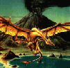
Old dragons get tired but they can still flame. Beware!
Old dragons get tired but they can still flame. Beware!
-
Instructor

- Site Admin
- Posts: 1869
- Joined: Thu Jul 21, 2011 8:51 am
Re: My final site
Ssssh! The dragon's sleeping. Best not to wake it up ...
Great execution of your concept. I think the repeating background worked really nicely. Good illustration work and blending of type within the design.
A couple of suggestions:
- Later on in the semester, I'm going to show you guys how to style links. That way they won't be blue and clash with your designs.
- I think it could use a Home button. Navigation might get a bit uncomfortable if it popped open a browser window every time you went somewhere.
"Inspiration is for amateurs. The rest of us just show up and get to work." — Chuck Close
Michael Ganschow-Green - GRC 175 Instructor
mganschow@tmcc.edu | 673-8200 ext.5-2173
Michael Ganschow-Green - GRC 175 Instructor
mganschow@tmcc.edu | 673-8200 ext.5-2173

Re: My final site
ohhh it's very nice. I like the concept of using words to create the mountains in the back, and how it gives an atmospheric perspective as it gets farther back. 
Vy Tat...
Re: My final site
I like the sketchy feel of the mountains and the ground. We haven't looked at it in class but you may want to change the contents of your Title tag in the Head section of your code so it doesn't say "final4_project1_slices".
Matthew Minten - GRC 175 - Fall 2011
Re: My final site
I agree - fix your <title>. Also, go into your <a> tag (your links) and remove the "target" attribute. Unless of course you were trying to open new windows/tabs for each page on purpose. In which case I suggest you rethink that strategy. Other than that, it's lookin' good!
This post has been brought to you by the letter X, the number 5, and Larry Rubald.
"It's irony at a base level, but I like it." ~Bill Hicks
"It's irony at a base level, but I like it." ~Bill Hicks
Project 1 Arlene Williams
Arlene Williams
Old dragons get tired but they can still flame. Beware!
Old dragons get tired but they can still flame. Beware!

Re: Project 1 Arlene Williams
Looks much better than the original rough. I like the colors much more and everything works well. Good job.
Kyle Smith
-
brienicole

- Posts: 132
- Joined: Mon Aug 29, 2011 5:02 pm
- Location: Sparks, Nevada
Re: Project 1 Arlene Williams
I think it would also be fun to add some links ( say the tmcc logo, and your email should be an email link) and this would be a fun page to hide some easter eggs on too. I love the dragon, very well illustrated. I am not a fan of that yellowish color but that's a personal taste thing.
~Brianne Porterfield
"What a crazy random happenstance!"
"What a crazy random happenstance!"
Re: Project 1 Arlene Williams
Yeah, using words to form mountains was an AWESOME idea. How did you do that? Just wondering. It makes your body copy part of the design, more so than just a block of text would be.
- Nathan Lundholm
Re: Project 1 Arlene Williams
I still like your design.  As a suggestion, keep in mind you don't have to have a "home" button to have a link back to home. For instance, you could make your name, or maybe the dragon, a link back to home. Also, I agree with making the email address a link. But I love your design and think it's really innovative, especially with your body copy.
This post has been brought to you by the letter X, the number 5, and Larry Rubald.
"It's irony at a base level, but I like it." ~Bill Hicks
"It's irony at a base level, but I like it." ~Bill Hicks