
http://grc175.com/student/fall_2011/jose_gomez_felipe/
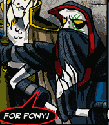
check it out =D oh and watch out for the pig ;D
Project_1 Jose Gomez
-
jfotodesign

- Posts: 32
- Joined: Wed Aug 31, 2011 6:58 am
- Contact:
 Project_1 Jose Gomez
my Kia beats

Re: Project_1 Jose Gomez
Not a huge fan of all the outlined type and you have some contrast issues with type in the top right but other than that it looks good and has a nice feel and layout.
Kyle Smith
-
jfotodesign
- Posts: 32
- Joined: Wed Aug 31, 2011 6:58 am
- Contact:
-
brienicole

- Posts: 132
- Joined: Mon Aug 29, 2011 5:02 pm
- Location: Sparks, Nevada
Re: Project_1 Jose Gomez
the outline type doesnt bother me as much as the green bar.. but you stick to your guns..haha  ( per our previous conversation) I think you probably need to copy edit that paragraph as well, but the overall layout is nice and works.
~Brianne Porterfield
"What a crazy random happenstance!"
"What a crazy random happenstance!"

Re: Project_1 Jose Gomez
I know some don't like the outlined text, but I do... but maybe not on the smaller type in the navigation. You definitely need to proofread and correct the grammar in your body copy and make sure it doesn't fade out over the white in the background. You could indent deeper to make sure it avoids that white background.
The photo is a great photo, and I like the transparent navigation box and it's glow. It has a nice look overall.
I am a bit confused about the little green character at the bottom left... is that a mistake, or is there some purpose... it seems cut off. Maybe make it more visible, or delete. It doesn't seem to go with your website the way it is.
Arlene Williams
Old dragons get tired but they can still flame. Beware!
Old dragons get tired but they can still flame. Beware!

Re: Project_1 Jose Gomez
lol! the pig from angry birds is awesome!
I agree with everyone, you have some contrast issues going on, but nothing that can't be easily fixed.
i'm def not a fan of the lazer green and glowing effects, but if that's you, than congrats! you met the project requirements.
I agree with everyone, you have some contrast issues going on, but nothing that can't be easily fixed.
i'm def not a fan of the lazer green and glowing effects, but if that's you, than congrats! you met the project requirements.
David Bjerre
I found sand!
I found sand!
-
Rogers_Neighborhood
- Posts: 27
- Joined: Tue Aug 30, 2011 5:58 pm
Re: Project_1 Jose Gomez
Love the angry birds pig and photo in the background, maybe if you got rid of the glowing effect of your navigation bar and the blue around the type it would look a bit better also the lines between the links could either be the same length inside the box and add one in between project 2 and inspirations it would be a little more unified or even get rid of the black lines all together. Good site!
Carrie Rogers
Re: Project_1 Jose Gomez
So, similar to everybody else it seems, a) I love the pig! and b) you've got some contrast issues.  The white text obviously needs the outlines (of one type or another) but the black and green might not. For your body copy, you might try something similar to your nav bar - give it a frame of some type (though for the body I might go a little more subtle than your neon sign nav bar - which I like by the way). One other thing I noticed, it seems the bar in your banner separating the lines matches up with the G on the left, but doesn't match up with the g on the right. I think you'll want to balance that. Overall thought, I'm diggin' it way more than I thought I was going to when you first showed the rough. Keep up the good work!
This post has been brought to you by the letter X, the number 5, and Larry Rubald.
"It's irony at a base level, but I like it." ~Bill Hicks
"It's irony at a base level, but I like it." ~Bill Hicks

Re: Project_1 Jose Gomez
Nice site overall, I like the picture your chose and the layout of your site. Though, i'm not a fan of text outline, so it's bothering me a bit....
Vy Tat...
Re: Project_1 Jose Gomez
Nice image. I would maybe make the GRC 175 a little smaller and add some rollovers to the social media buttons. You can make your name a little bigger if you want too.
Matthew Minten - GRC 175 - Fall 2011