
http://www.pokemon.jp/special/mystery/
http://skullgirls.com/
I Like the first website because the graphics are so well put together and they all mixed with no overlap or bleeding. It is a very beautiful website. The second i Picked is because it is nice and clean and organize at the same time you are able ot find any sort of information that you need.
Project 1-Preliminary
-
Kyler_Rose
- Posts: 97
- Joined: Wed Aug 30, 2017 5:11 pm

-
chaytothet
- Posts: 91
- Joined: Wed Aug 30, 2017 5:08 pm
Re: Project 1-Preliminary
Hey Kyler!
Nice use of white in your designs. I like the idea of making it on a piece of loose leaf paper, but I think you could do so much more with it!! You are talented with a pencil, make it YOUR piece of paper!! Scribble, abuse, and shove that paper in your backpack. Clean is for the weak! You are not part of that portion of the population. None of us are.
Loving the splat on the corner of the second one. I think you should do MORE! Simple is good, but this is a reflection of you, show your personality. I've had classes with you before so I know that's not all there is!
If this is at all offensive it wasn't meant that way, this comes from a really good intentioned part of my heart. <3
-Chalyn
Just because my path is different doesn't mean I'm lost
-Gerard Abrams
Just because my path is different doesn't mean I'm lost
-Gerard Abrams
-
Ltrueworthy
- Posts: 25
- Joined: Wed Aug 30, 2017 5:11 pm
Re: Project 1-Preliminary
I really like the ideas for your websites, especially the lined paper one. It looks like it was torn out of a notebook which makes it very interesting to look at and think about.
I had a thought for the second one (with the paint brushes), what if you added a painting easel or palette? the colors/paint on it could be the buttons to different pages plus then the fonts could be script looking if that makes sense. Or you could just add chucks/globs of color like the page itself is the easel. If it doesn't make sense you can ask me in class, i sit in the front on the right end (if you are in the back looking towards the front board.
I had a thought for the second one (with the paint brushes), what if you added a painting easel or palette? the colors/paint on it could be the buttons to different pages plus then the fonts could be script looking if that makes sense. Or you could just add chucks/globs of color like the page itself is the easel. If it doesn't make sense you can ask me in class, i sit in the front on the right end (if you are in the back looking towards the front board.
Lea Trueworthy

-
selvster5000
- Posts: 84
- Joined: Wed Aug 30, 2017 5:09 pm
Re: Project 1-Preliminary
Hiya Kyler!
Since I have already seen your thumbnails, I like the second concept more than the first.
The graphic elements tend to stand out a bit more and are thoughtfully placed in the
composition, which in return makes it more visually interesting. I also like how you
taped the Picture of Me.
A suggestion I would make is to align the body text to the edge of your project 2 box
in the center.
Great ideas and layout Kyler!
Cheers,
Hannah Selvey
Hannah Selvey
Re: Project 1-Preliminary
Hi,
I am going more toward your second layout. I like the brushes and I think the layout is looking good. Reading through the other comments, it sounds like you enjoy illustration. That would add a lot to your design if you incorporated that somehow.
I am going more toward your second layout. I like the brushes and I think the layout is looking good. Reading through the other comments, it sounds like you enjoy illustration. That would add a lot to your design if you incorporated that somehow.
Susie Lang
-
Instructor

- Site Admin
- Posts: 1869
- Joined: Thu Jul 21, 2011 8:51 am
Re: Project 1-Preliminary
Alright, you old self peeling potato. Let's see what you go for us.
Oh nice! I like the note pad paper design. That will go places. It's super easy to read and pull information out of. Your margins are well done. Everything has a nice amount of breathing space around it without being too far apart. Your navigation is placed in an interesting spot, but I had no trouble finding it. It should be easy to see and use once it gets type. Your images are similarly well placed, helping the eye to move from one navset to the other.
I'd recommend either Photoshopping your paper or, just scanning in some real lined notebook paper for you background. Like so:
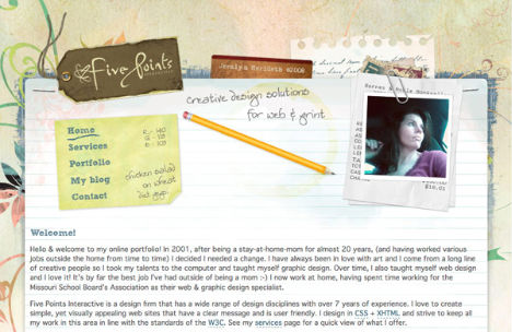

I'd also recommend using more of a handwriting font, rather than just an italic so it looks like the site title, page title, and bodycopy were handwritten in.
Good conceptual work.
Oh nice! I like the note pad paper design. That will go places. It's super easy to read and pull information out of. Your margins are well done. Everything has a nice amount of breathing space around it without being too far apart. Your navigation is placed in an interesting spot, but I had no trouble finding it. It should be easy to see and use once it gets type. Your images are similarly well placed, helping the eye to move from one navset to the other.
I'd recommend either Photoshopping your paper or, just scanning in some real lined notebook paper for you background. Like so:
I'd also recommend using more of a handwriting font, rather than just an italic so it looks like the site title, page title, and bodycopy were handwritten in.
Good conceptual work.
"Inspiration is for amateurs. The rest of us just show up and get to work." — Chuck Close
Michael Ganschow-Green - GRC 175 Instructor
mganschow@tmcc.edu | 673-8200 ext.5-2173
Michael Ganschow-Green - GRC 175 Instructor
mganschow@tmcc.edu | 673-8200 ext.5-2173
-
Pearl_Underwood

- Posts: 63
- Joined: Wed Aug 30, 2017 5:29 pm
Re: Project 1-Preliminary
Hi Kyler,
I like them both. I think you could go either way!
I like them both. I think you could go either way!
~Pearl Underwood~
Re: Project 1-Preliminary
Kyler,
Both home pages are still in the skeletal structure of the design, but the note book concept is actually pretty cool and it would be interesting to see what the layout and composition of the final would look like, some research will help with that. Adding some soft colors will help you design and contrast with the black text I assume you're going to use because generally people write in black. It would also be cool if you add an animation of flipping pages as you change from one link to another.
Jose Macias.
Jose Macias.
-
Ariesboxsye

- Posts: 76
- Joined: Wed Aug 30, 2017 5:10 pm
Re: Project 1-Preliminary
Great start to some concepts, I would like to see the first design pushed more as it would be nice to see a website with a college rule paper as its theme. However, these are missing some items and might need space for them.
~Names Aries Shelley~
-
CarnutianDragon

- Posts: 23
- Joined: Wed Aug 30, 2017 5:07 pm
Re: Project 1-Preliminary
Hi Kyler,
You have some great ideas here and I feel like your second design may yield more results. I am like the office/work table vibe as well as the photoshopped pencils and taped on images. However, I would move your body text elsewhere since it is making the design top heavy, and find a new place for your navigation.
Nice start and I can't wait to see the finished product!
Sarah Alvarado