
Prj1 Prelim Shalie Chakarun
-
schakarun714
- Posts: 53
- Joined: Thu Aug 28, 2014 5:41 pm
Prj1 Prelim Shalie Chakarun
My two inspirational websites are http://www.soundcloud.com because its a really interesting site visually and its also easy to navigate and it also allows you to discover new and up and coming artists, whats better than that. My second one is http://www.chromeindustries.com because it is one that i visit often and shop from, i like their use of photographs of their environment and their customers with their products.
- Attachments
-
-
Shalie C. Forever Dreaming
-
Sierragirlnv

- Posts: 96
- Joined: Thu Aug 28, 2014 5:35 pm
Re: Prj1 Prelim Shalie Chakarun
Hi Shalie,
I like the project one rough layouts you designed. I am leaning towards the first rough because it has a visual interest for me however I noticed the text at the bottom is having readability problems, it is getting washed out from the back round image. If you made the type a different color or used a block to help the contrast it would work better.
The second layout as neat as the design is I felt it was too distracting and took away from the rest of the design. I think it just has too much going on.
Great job!
Sierragirlnv
Re: Prj1 Prelim Shalie Chakarun
Hi Shalie!
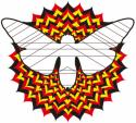
Did you create the star design in your first rough? It's very cool! However, it totally over powers all of your type. maybe you could lower the opacity on it so that your page is easier to read. The same thing is happening on your second rough. The text is lost in the image. A text box that has a low opacity level might work. The white buttons are very distracting, maybe adding a little color would help.
Did you create the star design in your first rough? It's very cool! However, it totally over powers all of your type. maybe you could lower the opacity on it so that your page is easier to read. The same thing is happening on your second rough. The text is lost in the image. A text box that has a low opacity level might work. The white buttons are very distracting, maybe adding a little color would help.
PaulaBurris
-
wendy_boddy
- Posts: 62
- Joined: Thu Aug 28, 2014 5:39 pm
Re: Prj1 Prelim Shalie Chakarun
Hi Shalie,
I love Big Sur so the first image is very appealing to me. I think text on the bar on the bottom of the screen could be more legible. Try a few different things like the opacity of the bar, the color of the copy or darkening the background image on the bottom and lightening the text. What ever you choose its a fine design. The second one is very interesting and it makes you want to go inside the drawing. maybe one day you could animate that if you wanted. Right now the image is competing with the bars and the overall usage of the site so I would create a little more black space separating the image and the bars so you can see everything and keep the strength of the star circle shape. I think the second one has a lot of potential for movement and sound if you wanted to go that direction. The fist one is a gorgeous image. I like that you went two very different directions with your imagery, but the layouts are pretty much the same. The second image could BE the layout. The buttons and where the copy goes could all be driven from the that very strong geometric image.
Tata for now!
Wendy

Re: Prj1 Prelim Shalie Chakarun
Hi Shalie,
As the others were saying, your second design gets lost a bit due to the star icon you have in the background. However, I think that the design could work out well as a personal logo, if you wanted to use one. As it stands, the colors are a little too opposite, so it really draws attention away from the rest of the image. What I do enjoy about the second design is how you've organized the navigation. I'm not sure that linking to Project 1 is necessary, seeing as this would already be that page, but if you were planning on adding some sort of indicator that tells people what page they're on then I could see it staying. I'm not sure about abbreviating the project links; you could probably shrink the text and fit the whole word.
The first design is nice, though the image looks to me like it's squashed a little. I agree that the text fades into the background in places, and I think that putting some sort of light opacity box behind the text would be a good option to help separate it from the image. When I looked at your name at the top of the design, I thought it could be neat if you shaved off parts of the letters of your first name to give the illusion that it's behind the mountains.
Between the two, I think the second design is the more unique choice, but the background definitely has to be toned down a bit, perhaps redesigning the icon to be a more analogous set of colors and making it less of a focal point than it is currently. Either way, I look forward to the final designs!
Ryan Segal
Radical Boy on a Mission
Radical Boy on a Mission
Re: Prj1 Prelim Shalie Chakarun
Hi Shalie,
I like the image in the bottom rough because it has depth and draws the viewer's eye inward.
I like the colors in the top rough.
I would work on making the text legible in both roughs.
I like the image in the bottom rough because it has depth and draws the viewer's eye inward.
I like the colors in the top rough.
I would work on making the text legible in both roughs.
Dominique Boudinot
-
ElizabethBrass

- Posts: 42
- Joined: Sun Aug 31, 2014 8:30 am
Re: Prj1 Prelim Shalie Chakarun
Hey Shalie,
I like the geometric image of the second rough. my thoughts are to try making that image either like a water mark, so turn down the opacity of it a lot. Or make it part of your logo. I feel like this one represents you more than the first one. great start!
I like the geometric image of the second rough. my thoughts are to try making that image either like a water mark, so turn down the opacity of it a lot. Or make it part of your logo. I feel like this one represents you more than the first one. great start!
Elizabeth_Brass
Re: Prj1 Prelim Shalie Chakarun
Hi Shalie,
I really like both of your roughs, they both have appealing color schemes and balance. However, I do have to agree with our fellow classmates that your bottom design is really good but the star design in the middle is a little distracting, yet I love how you created it. I would still use it though. I think it would look good if you use the opacity tool (then make it a little smaller) or make it smaller and use it as a logo on the top of the page by your name. I think your text looks great on the bottom rough but in the top rough I would work on making the content and bottom text more bold because it kind of blends in the background. Just a friendly reminder: don't forget to create space for your resource links and the TMCC logo. Great Job!
I really like both of your roughs, they both have appealing color schemes and balance. However, I do have to agree with our fellow classmates that your bottom design is really good but the star design in the middle is a little distracting, yet I love how you created it. I would still use it though. I think it would look good if you use the opacity tool (then make it a little smaller) or make it smaller and use it as a logo on the top of the page by your name. I think your text looks great on the bottom rough but in the top rough I would work on making the content and bottom text more bold because it kind of blends in the background. Just a friendly reminder: don't forget to create space for your resource links and the TMCC logo. Great Job!
Danielle Record
-
Instructor

- Site Admin
- Posts: 1869
- Joined: Thu Jul 21, 2011 8:51 am
Re: Prj1 Prelim Shalie Chakarun
Hm. You've got some interesting ideas here.
Of the two designs, I like your second one better. It's so deep. I think it's a much better foundation to build something really unique. The geometry and colors really work well together well. I feel like I'm looking down an infinite mirror I like how the teal and orange play off each other and the black. It's got good structure and the layout is pretty easy to follow.
What it needs is contrast. I have difficulty seeing the bodycopy and navigation through the shape. I'd recommend either making the shape a bit opaque or taking out the fill color and doing it as a stroke to make the shape not quite so dominant. I'd also stick a semi transparent box behind your bodycopy type to make it more legible. Also, lose the sans-serif font in the navigation. I like the serif font you've chosen for the rest of the design, keep it going.
I keep staring into that second design. So deep, man. I think it's looking back at me...
"Inspiration is for amateurs. The rest of us just show up and get to work." — Chuck Close
Michael Ganschow-Green - GRC 175 Instructor
mganschow@tmcc.edu | 673-8200 ext.5-2173
Michael Ganschow-Green - GRC 175 Instructor
mganschow@tmcc.edu | 673-8200 ext.5-2173

Re: Prj1 Prelim Shalie Chakarun
Hi Shalie,
Your designs are very compelling. I like the dominance of your name at the top. There are readability issues that you'll need to address in both versions— maybe add a translucent screen behind the text for more contrast. The second comp with the compass design is very strong— did you draw this? Awesome!
Your designs are very compelling. I like the dominance of your name at the top. There are readability issues that you'll need to address in both versions— maybe add a translucent screen behind the text for more contrast. The second comp with the compass design is very strong— did you draw this? Awesome!
Matthew