
Hello! These are my design for the new website. The old website can be found at the link below if ya'll would like to have a good laugh. The two design honestly are nothing like the website because it was made through bloger or something or other. The site lacked any information whatsoever on what they did at all for their company or anything to even indicate that their company was a professional heating and ac company for the past 13 years. I found that out by calling them. So here are my two designs.
These are the designs. the about me pages are the top page and the third page on this post. The home pages are the second and last images for the post.
Heres the link to the website: [url]http://www.westernheatinginc.com//url] steven dickson, Project 2, grc 175
Project Two Preliminary Critique
-
steven_dickson
- Posts: 14
- Joined: Thu Aug 28, 2014 5:31 pm

Re: Project Two Preliminary Critique
I think both your designs have a lot of potential. I'm not sure if the company had a logo or not, but placing a logo on your designs really bumped up the credibility, especially when it's completed, good idea! I'm leaning towards the second layout, because it looks less busy and more organized, compared to the first one.
a s h l e y c h i s a m
-
Sierragirlnv

- Posts: 96
- Joined: Thu Aug 28, 2014 5:35 pm
Re: Project Two Preliminary Critique
Hi there,
I am not sure which one is the first or second layout but I prefer the one with the header and logo and then the contact box displayed prominently underneath it. I think the hierarchy should always be the most important which in this case is the phone number. You had to plan a lot of content out since the actual website doesn't include much. I can see why that's not working...haha Good luck and great logo idea.
Sierragirlnv
-
georgia_novotny
- Posts: 79
- Joined: Thu Aug 28, 2014 5:46 pm
Re: Project Two Preliminary Critique
Hi Steven,
I think both of your ideas show a good start to your website redesign.
I agree that the site you picked needed lots of help making sense of what they do.
I like the top rough design, the one with the logo on the top left with its name.
I like the XL rotating photo area with the way the info is placed below it.
I would move the navigation to the top of the XL photos under the logo/name/phone #.
That would make more visual since in terms of page hierarchy and navigation.
I wish there was more to critique like color, fonts, photos etc.
I look forward to seeing more, nice start.
Georgia
-
ElizabethBrass

- Posts: 42
- Joined: Sun Aug 31, 2014 8:30 am
Re: Project Two Preliminary Critique
Hi,
Both of your roughs have great potential and they look better than the current website. I am liking the top rough more as far as layout. I like the slider photo at the top. Can't wait to see it in action.
Both of your roughs have great potential and they look better than the current website. I am liking the top rough more as far as layout. I like the slider photo at the top. Can't wait to see it in action.
Elizabeth_Brass

Re: Project Two Preliminary Critique
Hi Steven,
I like the composition of the first rough with the logo at the top left. I also like your design idea for the logo, I look forward to seeing how it turns out.
I like the composition of the first rough with the logo at the top left. I also like your design idea for the logo, I look forward to seeing how it turns out.
Matthew
-
rrodriguez

- Posts: 87
- Joined: Wed Sep 03, 2014 6:34 pm
Re: Project Two Preliminary Critique
Steven, I like the homepage with "Western Heating" on the upper left corner and the big photo underneath and buttons right below it. It's very informative, almost a little too much information for a home page. But when I look at the about page, and see a big photo and what looks like scrolling pictures above the information. I think the photos and the information will balance each other out and create a professional website that this company needs. A small business owner once told me, they wanted a blog type website because they felt they'd get more hits and their website would be more searchable with a blog style format. Maybe that's what this company thought as well? i don't know how true that is but there are a lot of companies out there getting hits and don't have a blog format. Can't wait to see how you progress, it should look pretty darn cool
"Something profound and awesome here and here and here..."– Rosa Rodriguez
Re: Project Two Preliminary Critique
Hi Steven,
I like the bottom set because I like how prominent Western Heating is, and I like the logo placement in the middle. The three column scheme is also effective. I think color choices could make or break these pages, so I am interested to see what schemes you choose. Any colors you pick are going to be better than the original site's, which make absolutely no sense. Good Luck with your final design!
I like the bottom set because I like how prominent Western Heating is, and I like the logo placement in the middle. The three column scheme is also effective. I think color choices could make or break these pages, so I am interested to see what schemes you choose. Any colors you pick are going to be better than the original site's, which make absolutely no sense. Good Luck with your final design!
Dominique Boudinot
-
old_man_pat

- Posts: 52
- Joined: Thu Sep 04, 2014 4:43 pm
Re: Project Two Preliminary Critique
Mr. Steve, funny you would pick an employer's website a buddy of mine happened to work for long, long ago. I want to tell him Master Dickson has come to his former employer's rescue, because his site sure needs help. I like both layouts, but I feel the top layout with logo in the upper left corner is preferable. The logo is well done. It's hard to tell from the sketches, but I believe the layout would benefit from footer content as well. I look forward to seeing you flesh this out.
Patrick Smith
“To find yourself, think for yourself.”
-Socrates
“To find yourself, think for yourself.”
-Socrates
-
Instructor

- Site Admin
- Posts: 1869
- Joined: Thu Jul 21, 2011 8:51 am
Re: Project Two Preliminary Critique
Yeah. It's a little hard to give good feedback on sketch roughs like this. I've seen a few now on this project and I think next semester I'm going to mandate all roughs be done on some sort of software so you guys can get the best feedback possible.
I'll offer what feedback I can on these, but I can't really say much to color or typography.
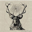
I really like the logo you've designed for them. I can say that at least. A very Fifth Element elemental stones kind of look. Nice!
Of your two, I like the first one better. I like the large image area slightly above a colored background stripe. Perhaps separated by a drop shadow. The three large call to action buttons are well placed and eye catching. I think the main navigation is working well, but could use to be enlarged/bolded a bit. I do like the marker tab as well. I also like the summary to the right of your bodycopy as well.
Good work putting their contact info to the top right. That's an excellent place to have it since that's a pretty commonly glanced at area and having a businesses contact info in easy reach is critical on small business websites.
That's about all I can offer at this point. From what I can see this website's going places. I look forward to seeing the finished version!
I'll offer what feedback I can on these, but I can't really say much to color or typography.
I really like the logo you've designed for them. I can say that at least. A very Fifth Element elemental stones kind of look. Nice!
Of your two, I like the first one better. I like the large image area slightly above a colored background stripe. Perhaps separated by a drop shadow. The three large call to action buttons are well placed and eye catching. I think the main navigation is working well, but could use to be enlarged/bolded a bit. I do like the marker tab as well. I also like the summary to the right of your bodycopy as well.
Good work putting their contact info to the top right. That's an excellent place to have it since that's a pretty commonly glanced at area and having a businesses contact info in easy reach is critical on small business websites.
That's about all I can offer at this point. From what I can see this website's going places. I look forward to seeing the finished version!
"Inspiration is for amateurs. The rest of us just show up and get to work." — Chuck Close
Michael Ganschow-Green - GRC 175 Instructor
mganschow@tmcc.edu | 673-8200 ext.5-2173
Michael Ganschow-Green - GRC 175 Instructor
mganschow@tmcc.edu | 673-8200 ext.5-2173