
My Awesome Roughs Because They're Awesome
-
steven_dickson
- Posts: 14
- Joined: Thu Aug 28, 2014 5:31 pm
-
Deth_Sines
- Posts: 9
- Joined: Thu Aug 28, 2014 5:41 pm

Re: My Awesome Roughs Because They're Awesome
Hi Steven,
Good Job on both of your roughs! Your header is visually appealing, your image is unique, which catches your attention right away and I think both designs are clean & simplistic. I think I'm leaning more towards layout #1 though. I feel the white navigation bar, header, & footer all balance each other out well. I like the simple city background with this color scheme because the lights in all the windows pop out at you, which balances out the white elements & it is eye catching. In layout #2, I like the initial layout, both unique designs in the navigation and in the header, but I feel the white background on the navigation & your background image is a little distracting. I have a couple suggestions for either rough that you chose to use. One, instead of just your initials and year in your header, I would add your full name and title to it. Second, I would suggest using your unique design that you created on layout #2 header and add your initials with it I feel that it would add more personalization. I can't wait to see your final rough!
Good Job on both of your roughs!
Danielle Record
Re: My Awesome Roughs Because They're Awesome
Wow Steven! Brand new stuff!! I like layout2. The header is great and the navigation on the right works really well. I agree that your name should be in there somewhere. The word, "reference" is spelled incorrectly (unless you're from Oklahoma, like me, then it's spelled just fine! Lol!) Good job!
PaulaBurris
-
justinepaigek

- Posts: 62
- Joined: Thu Aug 28, 2014 6:55 pm
Re: My Awesome Roughs Because They're Awesome
While the first rough's navigation is quite interesting and I like the two triangles in your header, I'm definitely leaning towards the second layout. It just has a better flow, and will be a lot easier to navigate and just looks a lot cleaner. Love your colors, use of pattern, and the city shot!
"I believe if you look hard, there are more wonders in this universe than you could ever have dreamed of."
Van Gogh said this. Not the real one, probably, just the one in that episode of Doctor Who.
Van Gogh said this. Not the real one, probably, just the one in that episode of Doctor Who.
Re: My Awesome Roughs Because They're Awesome
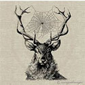
These are so fun! I feel like they really represent your character, especially with the "steampunk" looking photo. The colors and textures, even though they appear to clash, really seem to work well together. My pick is definitely the second layout, the first layout is just a little too busy for me, but both still work really well. Of the two, it's definitely the one with better balance, just need to include some text and I think it'll be great! I'm not quite sure about the white line cutting through the middle, it's a bit distracting, but it might flow better with a description. Good job!
a s h l e y c h i s a m
-
wendy_boddy
- Posts: 62
- Joined: Thu Aug 28, 2014 5:39 pm
Re: My Awesome Roughs Because They're Awesome
I like the second rough! very unique
wendy
wendy
-
wendy_boddy
- Posts: 62
- Joined: Thu Aug 28, 2014 5:39 pm
Re: My Awesome Roughs Because They're Awesome
wait, i mean the first one. Layout 1 to be exact is very clean and fun. Layout 2 is not as easy to look at because it is busy.
wendy
wendy
Re: My Awesome Roughs Because They're Awesome
Hi Steven,
I like the background photo in the bottom layout, but the right sidebar navigation in the top layout. I would combine them. Your cool color scheme is really working for you. Good Work!
I like the background photo in the bottom layout, but the right sidebar navigation in the top layout. I would combine them. Your cool color scheme is really working for you. Good Work!
Dominique Boudinot