
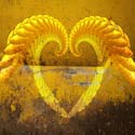
Concept 1 - I would use an image of what we called a "cootie catcher" when I was a kid. Not sure what it's called now. So it opens up when you choose a flap such as "faculty" and then there would be other choices inside that flap. I apologize for not posting much in the way of images, but I was already behind so this is a very preliminary rough. With this concept, I wanted to find a sort of handwritten font, but then found some others that I liked. So I need some advice as to which one I should use.
Concept 2 - I thought about using a color wheel as the main image and then each color would be the button to navigate around the site. I captured this image from a color wheel site, but I also thought about using the one from color theory class, either the one I painted or one from the book.
Thanks in advance for the input.
Denise
prelim 3 crit
prelim 3 crit
- Attachments
-
- concept 2
-
- concept 1 - page two
-
- concept 1 - page one

Re: prelim 3 crit
Your first concept to me seems like it would lend itself easily to be animated. Your second idea I think could turn out well if you make the type on the page match the color it corresponded with. I cant make a judgement on which one is stronger since I only see one layout.

Re: prelim 3 crit
Chris, animating the cootie catcher was my first thought with that one. I'm not sure how I would do that but I sure would like to try!
Thanks
Denise
Thanks
Denise
-
angelraiders
- Posts: 50
- Joined: Mon Jan 23, 2012 7:35 pm
Re: prelim 3 crit
Please go with the cootie catcher. Its really interesting, and simple. I could see it coming alive with some rollovers.
-
angelraiders
- Posts: 50
- Joined: Mon Jan 23, 2012 7:35 pm
Re: prelim 3 crit
Please go with the cootie catcher. Its really interesting, and simple. I could see it coming alive with some rollovers.

Re: prelim 3 crit
yea im like this first concept, im leaning more towards hand written type as well and I think you could also include little hand drawn sketches into it as well maybe next to the words such as "faculty" idk just a thought, it what I saw coming to life but very cool idea!
faith
faith
"Design is simply thinking made visual"
Re: prelim 3 crit
oooooh, you have good ideas!
Both are great ideas. If you go with the colorwheel, I'd use the graphic you posted here --very precise, says 'design'. And I'm thinking there would be no titles except maybe tmcc grc somewhere that seems natural for the graphic (like in place of the brand name of the people who make these things). And the mouse overs would be the only indication that this page is live with clickable areas. I know that's risky for people who don't move their mouse much --they may not see all the areas you have. But for the design-savvy, you'll have them hooked at how cool we are.
If you do the cootie catcher (I always called them fortune tellers, does anyone really catch cooties with them?) I think you should hand draw the type and illustrations, scan in, place on transparent background and save as png.
Have you seen the intro to Community? They have a cool cootie catcher. I've always liked seeing it. I can't help but visualize that. It should be on youtube if you want to see it.
I'm anxious to see what you do. Really nice ideas.

Re: prelim 3 crit
What an interesting idea! I like the cootie catcher!
-
Instructor

- Site Admin
- Posts: 1869
- Joined: Thu Jul 21, 2011 8:51 am
Re: prelim 3 crit
Ha! And yet another example of two very strong ideas.
I think both could work very well, but I too like the idea of the "cootie catcher" either as a vector design or as a series of scanned colored papers. I'd recommend doing a different colored paper/vector drawing depending on what page the user was on. You're going to have to be careful in preserving the sense of whimsy of the "cootie catcher" design when you introduce images and bodycopy into it. Maybe have the images be cutout triangles that fit into the triangular folds of the "cootie catcher"? It'll be interesting to see what you do on this one.
Good work and very fun!
"Inspiration is for amateurs. The rest of us just show up and get to work." — Chuck Close
Michael Ganschow-Green - GRC 175 Instructor
mganschow@tmcc.edu | 673-8200 ext.5-2173
Michael Ganschow-Green - GRC 175 Instructor
mganschow@tmcc.edu | 673-8200 ext.5-2173
-
JohnLemieux
- Posts: 25
- Joined: Mon Jan 23, 2012 6:44 pm
Re: prelim 3 crit
The cootie catcher works for me as well. I think if you want to animate it you can use certain elements from either HTML5 or JQuery to pull off the animation. It would look great if you pull it off though.