Page 1 of 2
Project One
Posted: Fri Mar 01, 2024 10:57 pm
by CadenM
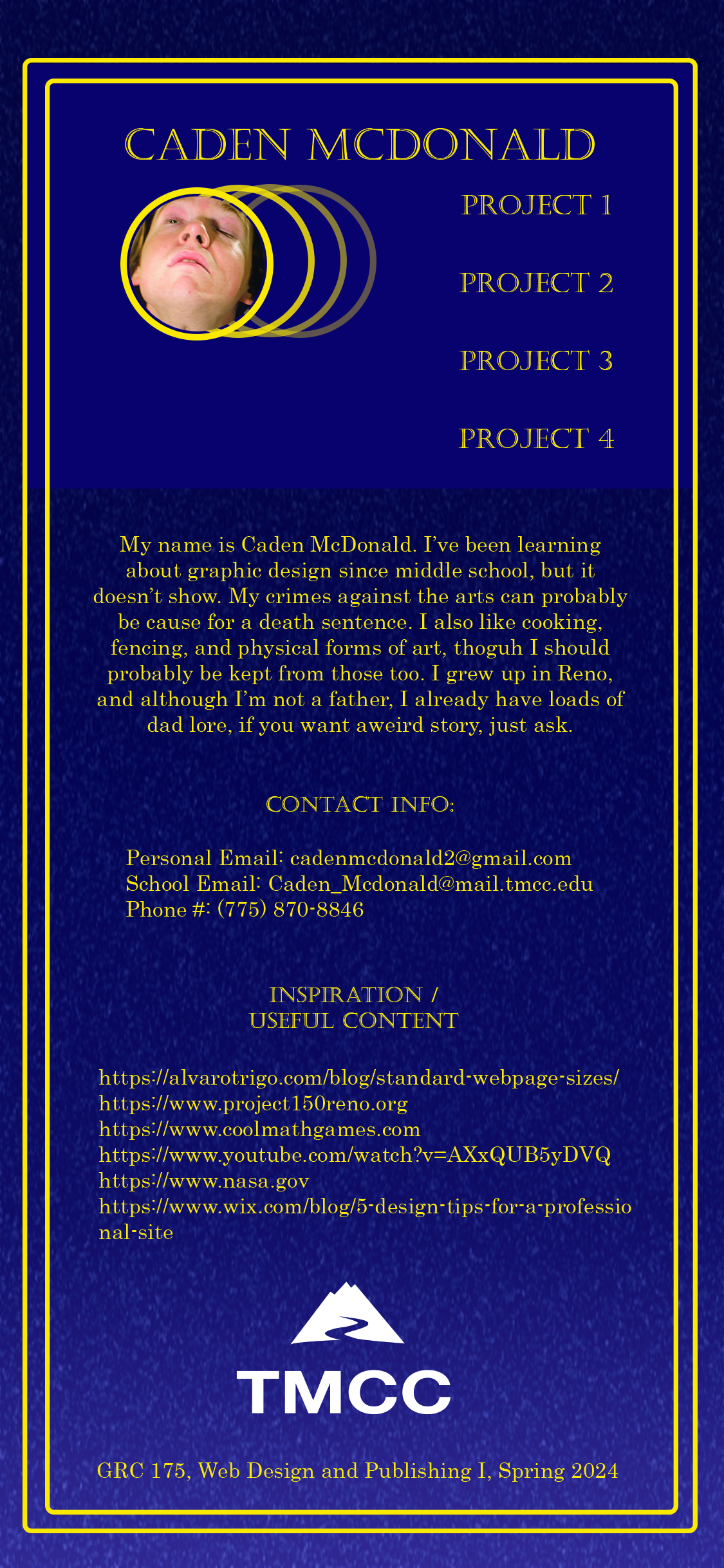
My name is Caden McDonald. The idea of making my project space-themed came from the soundtrack that plays in the background of my web browser. It sounds spacey. *I'm* spacey. It was truly meant to be. I also considered a nature theme, but decided the contrast between the calm starry sky of my final design and the stupid picture of myself I'm using was funnier. Following along the idea of space, I decided to make my webpage font and color scheme gold. It was based on the reflective material put on spacecrafts to regulate temperature and absorb light, plus gold makes a nice contrast on purple. The reason I chose that photo of myself is because it's funny. That's all I got.
Useful web pages:
https://alvarotrigo.com/blog/standard-webpage-sizes/
This one is pretty self-explanatory. I wasn't sure what size I wanted my webpage to be, so I used this page to examine my options.
https://www.wix.com/blog/5-design-tips- ... ional-site
This one gave more basic tips for page design and formatting.
- Mobile Version
- project01-final-phone.tif (24.67 MiB) Viewed 276 times
- Computer Version
- project01-final.tif (41.87 MiB) Viewed 276 times
Re: Project One
Posted: Fri Mar 01, 2024 11:26 pm
by CadenM
Hey past Caden, you stupid goober, you got a much better design idea *after* finishing your final design!!! Oh well, I'll remake it eventually if I ever get around to it. Nice choices for typography, that's the most handsomest photo of you of all time.
--Present Caden
Project One-fixed
Posted: Sat Mar 02, 2024 12:44 pm
by CadenM
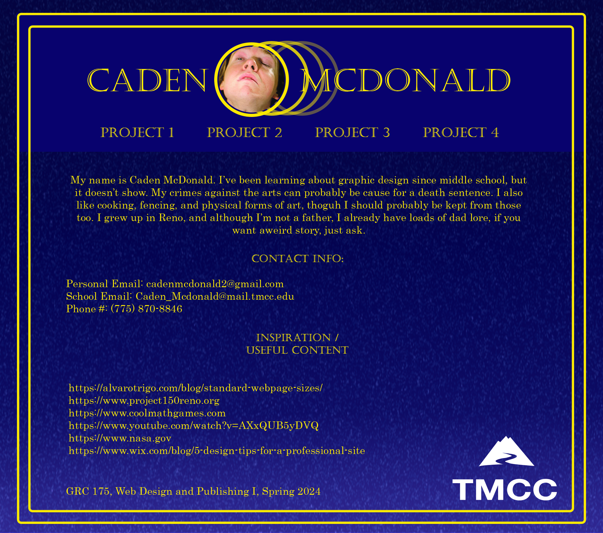
My name is Caden McDonald. The idea of making my project space-themed came from the soundtrack that plays in the background of my web browser. It sounds spacey. *I'm* spacey. It was truly meant to be. I also considered a nature theme, but decided the contrast between the calm starry sky of my final design and the stupid picture of myself I'm using was funnier. Following along the idea of space, I decided to make my webpage font and color scheme gold. It was based on the reflective material put on spacecrafts to regulate temperature and absorb light, plus gold makes a nice contrast on purple. The reason I chose that photo of myself is because it's funny. That's all I got.
Useful web pages:
https://alvarotrigo.com/blog/standard-webpage-sizes/
This one is pretty self-explanatory. I wasn't sure what size I wanted my webpage to be, so I used this page to examine my options.
https://www.wix.com/blog/5-design-tips- ... ional-site
This one gave more basic tips for page design and formatting.
Re: Project One
Posted: Sat Mar 02, 2024 3:36 pm
by troutbelli
Caden,
The colors are great. Regal if you will. Ok so that's what I am getting over space theme. But that being said, it's really good, shows your sense of humor and looks like you have good things on the horizon. I love the font choice; you have a definite theme going on.
Re: Project One
Posted: Sat Mar 02, 2024 6:37 pm
by Laura
Hi Caden! I always love funny, and humor is always good thing to me. Just be you! I like space idea, I do see more of a diploma or license. However, good contrasting colors and I like the funny photo. Nice job.
Re: Project One
Posted: Sat Mar 02, 2024 10:49 pm
by Instructor
Picture aside, this is a classy website you have here, Caden. It looks like the folder a university diploma would come in.
It really does look like textured paper with gilt lettering and artwork. The fonts speak to an institution with years of trust behind it. One that educates some of the finest minds in the country today. And if it's not a university, it's a prestigious law firm or investment bank. What perfectly chosen type and colors to give that effect. And then what makes this whole deal really funny is your picture.

I did a double take and laughed out load at it. An impressive take, my good man. Great use of margins on the thing as well. Everything has room to breathe. The navigation is front and center and the first thing the eye sees after the image.
I'm not sure you needed the even dark blue behind your nav and picture. I think your textured gradient would have been just fine here.
Nice work!
Re: Project One
Posted: Sun Mar 03, 2024 1:26 am
by seungwoo lee
Hello Caden,
I think your web design is special. Dark background and bright color border really go well together. And I think your layout is well placed. Also, I think type font worked well. But I think you should use various type styles. Also, I think it's good to add other images.
Re: Project One
Posted: Wed Mar 06, 2024 8:16 pm
by SandraT
Hello Caden,
I love the purple and the crisp lines throughout your designs. The gold goes so well with that purple and everything is spaced out almost meticulously.
Nice work
Re: Project One
Posted: Thu Mar 07, 2024 11:02 am
by Benjamin_Anderson
Hi Cade,
Your design is amazing. I enjoy the colors, and how you did your photo. The fading circles behind your photo is great.
Benjamin Anderson
Re: Project One
Posted: Fri Mar 08, 2024 8:15 am
by sothgara
Hello Caden,
I love your layout, and the image for some reason makes me feel like you are a fortune teller, lol. Everything is spaced out and looks very crisp. I also love the colors, not too harsh on the eyes. If I were to change anything, maybe take out the tmcc logo and type it out so it could be yellow? Great work.