
Project 01 Final
-
shasta_cola
- Posts: 12
- Joined: Mon Sep 04, 2023 10:51 pm
Project 01 Final
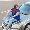
For my final design, I decided to keep my yellow and purple theme because I felt like it was more personal and fun. I changed the size and position of my project buttons slightly. I also made the purple circles filled and slightly transparent instead of just having the outlined circles. I added a photo of myself at the hot air balloon races because that is one of my favorite things to photograph. Lastly, I added my biography paragraph.
- Attachments
-
-
~ Shasta Mori ~
Re: Project 01 Final
whimsical website! The transparent circles are a nice design choice. The hot air balloons really go with the the rest of the design. Super nice
alexandra buyck 
-
Brooke_Brown
- Posts: 57
- Joined: Tue Aug 22, 2023 11:24 am
Re: Project 01 Final
Hello Shasta! I love your design! Its so colorful and fun and i love the color combinations you used 
Brooke Brown
Re: Project 01 Final
Yes, Shasta!!!
This is a very good design. I love your choice of colors and layout. I kind of reminds me of the Reno Air Races!
The only suggestion I would give would be to remove the tabs and replace them with a hamburger (dropdown) menu on the mobile version for easier navigation purposes. Well done!
This is a very good design. I love your choice of colors and layout. I kind of reminds me of the Reno Air Races!
The only suggestion I would give would be to remove the tabs and replace them with a hamburger (dropdown) menu on the mobile version for easier navigation purposes. Well done!
Warm Regards,
LaTara Misher
LaTara Misher
-
chloecutter
- Posts: 72
- Joined: Thu Aug 24, 2023 5:28 pm
Re: Project 01 Final
Shasta! I absolutely love the circles in the background, it plays into the idea of the hot air balloons in the background of your image. The color choices, fonts, and layout of your website come together nicely and creates a bubbly, fun vibe!
-
Instructor

- Site Admin
- Posts: 1869
- Joined: Thu Jul 21, 2011 8:51 am
Re: Project 01 Final
Okay, so fun is clearly being had here. I can tell! Now I want to take off in a hot air balloon.
The whole fun vibe of this thing really sticks out to me. I'm picturing your circles slowly bouncing around the screen in the background, or rising up toward the top like the hot air balloons in your picture. The rounded buttons add to the borderline 90's Memphis design feel of the whole thing. Good color choices too. It's difficult to go wrong with complimentary colors and the black and white add a nice contrast. The whole design uses contrast extremely well. Margins, too. Everything has room to breathe and spread out without fragmenting. A tougher task that it sometimes seems. The typography compliments the gentle fun vibes too. I especially like the marker font you used for your title and your navigation. Speaking of navigation, you're seems easy to see and, hypothetically, use.
I don't necessarily think you needed the purple boxes behind your text content. Maybe a lighter circle or two where they crossed behind important info, but that was it. As it is, at least their edges should be rounded to go with your buttons and the circles in your background.
Nice work!
"Inspiration is for amateurs. The rest of us just show up and get to work." — Chuck Close
Michael Ganschow-Green - GRC 175 Instructor
mganschow@tmcc.edu | 673-8200 ext.5-2173
Michael Ganschow-Green - GRC 175 Instructor
mganschow@tmcc.edu | 673-8200 ext.5-2173
-
KAWINTHRAC
- Posts: 64
- Joined: Fri Aug 25, 2023 7:06 pm
Re: Project 01 Final
Hi Shasta, I think you are successful for your goal to make it fun vibe. I can feel it with your color choices, circles, and your image, balloons! Your layout looks good and easy to navigate too.
Kawinthra Chongsuksantikul
Re: Project 01 Final
Hello Shasta!
Very nice work coordinating the outfit with the page design. The layout between computer and mobile is smart and simple, along with the type face used (save for the fun one used for your name, which is great!). you captured a very artistic feeling presentation. Awesome!
Very nice work coordinating the outfit with the page design. The layout between computer and mobile is smart and simple, along with the type face used (save for the fun one used for your name, which is great!). you captured a very artistic feeling presentation. Awesome!
-Nathan Grover
-
Genevieve Dierenga
- Posts: 76
- Joined: Wed Aug 23, 2023 5:36 pm
Re: Project 01 Final
Hello, Shasta!
I really love your yellow in purple color combination. You can never really go wrong with a yellow and a purple together. Your design looks very easy and simple to navigate. It is also great how you laid out your page. also love the handwritten font you used for your name.
I really love your yellow in purple color combination. You can never really go wrong with a yellow and a purple together. Your design looks very easy and simple to navigate. It is also great how you laid out your page. also love the handwritten font you used for your name.
Re: Project 01 Final
Hi shasta!!
Love the colors and whimsy of this!!! Feels very fun while still having structure. Great job!!
Love the colors and whimsy of this!!! Feels very fun while still having structure. Great job!!
-- Anastasia Valory 