Project One Preliminary Critique

Post links to your Project One websites for discussion and feedback.
Locked

Which set do you like best?

The first one!
4
100%
The second one!
0
No votes
 
Total votes: 4

User avatar
shasta_cola
Posts: 12
Joined: Mon Sep 04, 2023 10:51 pm

Project One Preliminary Critique

Post by shasta_cola »

Hey there everyone! I'm a bit late to the party, but I hope I can still get some good critiques! :D

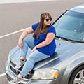
For my first design, I wanted to make an interesting layout that is a bit different than typical websites. My "about me" info will be in a paragraph or two at the top of the page, along with a large image of myself. Instead of having my name at the very top of the page, I moved it towards the middle. Below that is the class info and my email. Under that, I have four yellow buttons for the project links, and finally, I have another small image and the TMCC logo. I used fun complimentary colors because I feel like they represent my warm personality.

My second design has more of an obvious hierarchy in it. My name is in big, capital letters at the top. Below, I will have three spaces for images and then the "about me" blurb. Next, I have the class title and TMCC logo along with a fourth space for a photo (being a photographer, I love to show off my work!). On the far left, or bottom if you are looking at the mobile layout, I have my four project buttons with a little room for additional info. In the computer version, I had a little trouble finding a way to combat all that negative space in the top right without making it look too different from the mobile version. Anyone have advice for that? :)

For inspiration, I looked at lots of Pinterest designs and a couple photography websites.

https://www.beccaevansphotography.com/? ... gKrT_D_BwE

https://www.whiskeyshotsphotography.com ... gLraPD_BwE
Attachments
Computer 1
Computer 1
Mobile 1
Mobile 1
Computer 2
Computer 2
Mobile 2
Mobile 2
~ Shasta Mori ~

onnimelon
Posts: 71
Joined: Wed Aug 23, 2023 8:03 pm

Re: Project One Preliminary Critique

Post by onnimelon »

The first 2 designs have more of a personal feel to them. Plus I just think it's visually more interesting but they're both good!
However that GRC175 Web Design... text is getting squashed too much in that blue box. Make the font smaller for sure
alexandra buyck :D

User avatar
anacatnic
Posts: 27
Joined: Fri Aug 25, 2023 3:27 pm

Re: Project One Preliminary Critique

Post by anacatnic »

Hi Shasta!

I like that first design!! The contrasting colors help give your eye a direction to follow and keep it light and fun :)) I also like your second design but it almost feels too rigid with how hierarchy-focused it is. Maybe adding pops of another color to create some visual interest or having the red and blue interact in a way that's similar to the first design. Can't wait to see the result!!
-- Anastasia Valory 8-)

User avatar
Instructor
Site Admin
Posts: 1869
Joined: Thu Jul 21, 2011 8:51 am

Re: Project One Preliminary Critique

Post by Instructor »

Usually I'm all about whichever one has the best contrast, but not here. Here I like your first one better. I think it has a better layout and a sense of fun to it.

That first design has kind of an early '90s TV show credits feel. I like the way the circles and dotted lines lead the eye through the composition, from one content area to another. Good type selection. Your typefaces give the whole thing a written on, scrapbook feel that works well. Your navigation is very easy to see and should be easy to use. The purples, yellows, golds, and white that you've selected play well together too. It's a bright, sunny, optimistic design that makes me smile.

Watch your horizontal and vertical alignments of your button text within your buttons. They seem a bit all over the place. Your margins between your content and the boxes containing it it seem uneven, more one one side than another. Make sure the margins are even.

Good effort!
"Inspiration is for amateurs. The rest of us just show up and get to work." — Chuck Close

Michael Ganschow-Green - GRC 175 Instructor
mganschow@tmcc.edu | 673-8200 ext.5-2173

User avatar
sophy_gg
Posts: 31
Joined: Tue Aug 22, 2023 3:54 pm
Contact:

Re: Project One Preliminary Critique

Post by sophy_gg »

Hey Shasta

I like your both designs version adding shapes in the background and the layouts are very cool. I hope to choose the first design because the colors are very beautiful coloring yellow and violet. Nice job.
✦SØphia~GØmeƵ✦

LMisher
Posts: 91
Joined: Tue Aug 22, 2023 7:46 am

Re: Project One Preliminary Critique

Post by LMisher »

Hello Shasta!

Both versions of this project is good. I really like Version 1! The colors are nice and the page is clean. I would have liked to have seen a picture to fully bring both designs to life. Also, I would just have one suggestion for the mobile versions... Instead of having the buttons (project 2-4), I would replace them with a hamburger menu. This will allow more space on the mobile version of the site. Overall, you did a great job. I look forward to seeing the final version of your project.
Warm Regards,

LaTara Misher :D

ngrover19
Posts: 51
Joined: Thu Aug 24, 2023 8:46 am

Re: Project One Preliminary Critique

Post by ngrover19 »

Hi Shasta!

The blue and yellow submissions are exuberant! The shadowed buttons and typeface on them are more of this fun feeling, and the body of text really doesn't detract too much despite being on the bolder side. As for a critique, the empty yellow boxes almost make me wish there was more to look at in them, without becoming too busy and distracting. Overall, really good work!
-Nathan Grover

CedarM
Posts: 113
Joined: Tue Jan 28, 2020 7:05 pm

Re: Project One Preliminary Critique

Post by CedarM »

Hi Shasta,
I really like your first page design. I think you did a great job with the colors you've chosen, and I really like how you added the black and white circles to the background, this gives your piece more depth and visual interest. I think one this you could add is drop shadows to the image boxes like you have with your text boxes. I think this will help give the page more unity.

-Cedar
- Cedar Moosmuller

Brooke_Brown
Posts: 57
Joined: Tue Aug 22, 2023 11:24 am

Re: Project One Preliminary Critique

Post by Brooke_Brown »

Hey Shasta! I really like your designs but I really really like your first design! I love the welcoming colors and the bubbles in the background and i also love your buttons for the different sections of your website! I think the drop shadow looks really good :)
Brooke Brown

Locked