Well, here they are the preliminary roughs I went two different ways for each one.
My first one has a warm color scheme with a soft Retrowave inspired look I personally like the colors but I'm not sure if I like the formatting with this style. though the colors are warm and inviting the images I have don't fit with my aesthetic very well. I like the font the best as it fits the retro style I was going for.
As for my second rough I went for a Memphis-inspired design, Memphis has more geometrical shapes and neat formats I think to work better for a webpage which is why I chose it. I struggled with the colors here for a while you can have so many patterns and designs at once it hard to settle on just a few. while I do think this works better for the web format it doesn't work well with the mobile one imo.
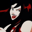
Obligatory mention of your Hex Girls profile pic, amazing!
Now for your designs:
Wow... Your color schemes are iconic! I absolutely love the pastels mixed with the bright pops of color!! I think I definitely favor the second design out of the two, but only because I can definitely see it being easier to personalize with time. The first one is so solid in terms of, well, everything, but the second one I see being much more unique and personal!
These are incredible designs, can't wait to see what your final website looks like : )
Hi Olive,
I like all the bright colors in your layouts! I like the second one the best because the darker purple text is easier for me to read. I might try playing with the colors of the footer because they are just a tad bit hard to read. Overall it looks really cute!
super cute style overall. Im obsessed with your heart cursor I thiiiiink I like your first concept better because you really nailed the look of feeling like Im in a video game or show or something. The whole thing looks like its glowing too. Maybe just watch your margins a bit at the bottom
I think the first layout's composition is really strong. Everything seems weighted and the colors go very well together. I like how the second layout is more unique, rather than focusing on outside graphics. I like the shapes on the second layout, it reminds me of the 70s or something I would see as a background for "Head Space" (the sleeping app lol). The style of vectors is very similar. I would change the color of the font to best fit the design.
Isabelle Bento (the person with the basic anime girl hair cut)UwU
Hi Olive,
Love the colors for both of them, they're both very fun to look at. As someone who also love Memphis I feel look you could push it a little further, more shapes, patterns, over lapping! It can be a really busy design but if you're only using it in a small section I feel like it won't be so overwhelming.But if you go with either one it'll be great, can't wait to see what you do!
Wow! Have we got some serious Lisa Frank aesthetic going on here. So bright! S O B R I G H T !
For all that I am getting retinal damage looking at it (I'm going to go get my sunglasses), I like your first design better. It reminds me of sherbet ice cream, or a cake. Aside from the white type, I really like your color choices here. They go well together and go well with your avatar over on the right. They're bright (I'm blind) and energetic. The whole thing exudes a positive happy energy. I like how your peach and pink blend smootly together. The retro 16 bit Gudetama graphics you're rocking here bring a smile to my face as well. Little faces everywhere. The layout is pretty clean, my eye moves through it easily and your navigation is easy to find. When I'm able to perceive them, I quite like your font choices as well. They fit with the retro dessert aesthetic you've got going on.
Oh no! Is that a custom cursor graphic?
Honestly, I think what would fix the brightness issue is just making the type a dark color. Maybe a dark pink, dark orange, or even black. The white type on a light background makes it blaze away with brightness and makes the type difficult to read. Also, you don't need the top and right white areas on your computer design. It would work just fine going edge to edge.
I am blind now. You're all doing braille designs for me on all future projects.
Nice work!
"Inspiration is for amateurs. The rest of us just show up and get to work." — Chuck Close
Michael Ganschow-Green - GRC 175 Instructor mganschow@tmcc.edu | 673-8200 ext.5-2173
I really like both color choices for both of your designs; they really give off a sense of positivity at first glance. If I were to choose, I would continue working with the first set because I am really into the colors and the backdrop panels for the text. I do slightly think the bright pink your mobile design a bit too much, but that is my only complaint, but I do say it does quickly give attention to your name.
Hi Olivia,
I'm really liking your first rough. The gradient looks a little different in the mobile and website version. Maybe checking that to make sure it's the same. Unless you wanted it to be different. I also like the heart cursor .
Wow! These are some really cool designs. I'm personally leaning towards the first one. Usually not a huge fan of gradients, but I think it works really well here. I also love the images you've used. The colors all work really well together. One thing I'd suggest is making your orange text boxes slightly darker so your white type can stand out a bit more. Great work!