
project 2 prelim
-
veronica chapman
- Posts: 90
- Joined: Wed Sep 05, 2018 5:25 am
project 2 prelim
the original website address is http://www.oozak.com these are very rough! had to turn something in but have already started making changes.
- Attachments
-
-
-
-
-
-
-
-
Last edited by veronica chapman on Fri Oct 26, 2018 10:59 am, edited 1 time in total.
-
kayla.pressburger

- Posts: 85
- Joined: Mon Aug 27, 2018 6:23 pm
Re: project 2 prelim
These definitely convey what the website is about a lot better than the original. I prefer your layout with the brushes and paint over the red paint splatters. The red paint splatters one gives off more of a horror movie vibe to me than an art store. I like the font you used on the brushes one, since I think it's the Indiana Jones font and it makes me feel adventurous.
Kayla Pressburger
Re: project 2 prelim
The original site was bad!! Interesting layouts, they definitely give the impression of art supplies. I like the red layout, but I think it would be more effective to use multiple colors or even more different medium strokes like color pencil marks with the paint effects. Cool work
Dana Drakulich-King
-
tweetysmurf2350
- Posts: 103
- Joined: Mon Aug 27, 2018 8:14 pm
Re: project 2 prelim
I like the one with the paintbrushes and the text that reminds me of Indiana Jones. You might want to add more content to the interpages. Just a thought.
Terri J. Taber
"Happiness can be found in even the darkest of times, if one only remembers to turn on the light." - Albus Dumbledore
"Happiness can be found in even the darkest of times, if one only remembers to turn on the light." - Albus Dumbledore
-
agostina_renau
- Posts: 100
- Joined: Wed Aug 29, 2018 3:56 pm
Re: project 2 prelim
these are fun and artsy for sure. One thing that bugs me is the drop shadow in the text! good job
Agostina From Argentina
Re: project 2 prelim
These are definitely an improvement from the original website. On their website they have an image of the store and their sign is actually really cool, they already have a cool name/font to work with, but the sign is like a burnt orange color, maybe you could try incorporating that? I prefer the paint brushes design!
Starfish ✩ emily duke
-
raton de biblioteca
- Posts: 106
- Joined: Sun Sep 02, 2018 5:03 pm
Re: project 2 prelim
The second roughs are more readable to me, I freaking love the amazing comic book font choice! The color pop against the brown background is wonderfully done, the added transparency to this to poke fun at the color of the water when are cleaning off the brushes! Since the logo is getting lost in the dark background, I might even add a yellow effect to the black logo for greater emphasis... Maybe more of a batman theme?
Rachel Cao
We are all just having too much fun
We are all just having too much fun
Re: project 2 prelim
I am drawn most to the second options. It is easier to quickly discern what is going on with the page. Perhaps change the color on the first one? At a glance it looks like blood splatter, though it is very eye catching.
-
Instructor

- Site Admin
- Posts: 1869
- Joined: Thu Jul 21, 2011 8:51 am
Re: project 2 prelim
I like the vertical splatter design myself. Or rather, I like what it could be.
It has such a strong central alignment that it immediately draws the eye. The white background and vivid color provide great contrast and allow for some fascinating interplay between content and imagery. Your type works really well too. The brush stroke logo type gives the logo a feeling of being hand inked and it plays nicely with the simple serif bodycopy to create a warm effect, which is nice for an art store website. You use margin well throughout the layout to create great patterns with proximity. Good visual hierarchy too, especially on the home page.
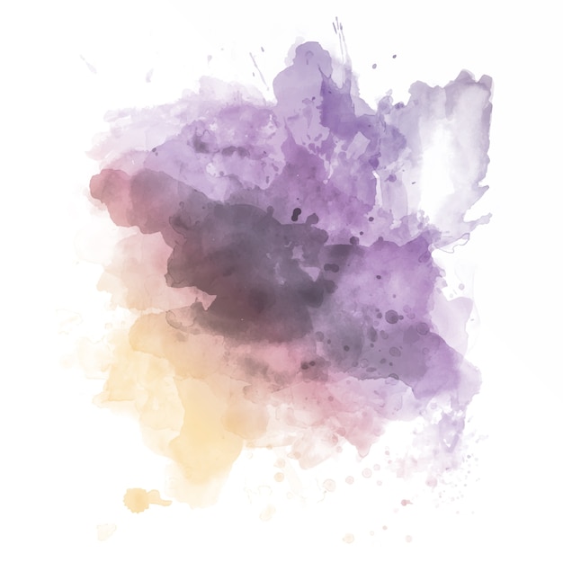
My big issue is the color. Red seems bloody and the website looks like a bandage that's been over a seeping wound for a while. It would completely wake the design up and make it something really special if the splatter, instead of just being red, was multi-colored like these. The red is just too strong of a color and completely changes the tone of the composition. Too bad there isn't a lot of bodycopy on the inner page for us to critique.
Good effort!
It has such a strong central alignment that it immediately draws the eye. The white background and vivid color provide great contrast and allow for some fascinating interplay between content and imagery. Your type works really well too. The brush stroke logo type gives the logo a feeling of being hand inked and it plays nicely with the simple serif bodycopy to create a warm effect, which is nice for an art store website. You use margin well throughout the layout to create great patterns with proximity. Good visual hierarchy too, especially on the home page.
My big issue is the color. Red seems bloody and the website looks like a bandage that's been over a seeping wound for a while. It would completely wake the design up and make it something really special if the splatter, instead of just being red, was multi-colored like these. The red is just too strong of a color and completely changes the tone of the composition. Too bad there isn't a lot of bodycopy on the inner page for us to critique.
Good effort!
"Inspiration is for amateurs. The rest of us just show up and get to work." — Chuck Close
Michael Ganschow-Green - GRC 175 Instructor
mganschow@tmcc.edu | 673-8200 ext.5-2173
Michael Ganschow-Green - GRC 175 Instructor
mganschow@tmcc.edu | 673-8200 ext.5-2173
-
jason_hosier

- Posts: 109
- Joined: Mon Aug 27, 2018 6:21 pm
Re: project 2 prelim
i like your color scheme. looks like you are keepin it simple and that is good.
"Any law that cannot bend in a storm is destined to be broken."