

The two competitors I found are: http://www.demersvision.com/ and https://www.drhum.net/.
My inspiration was: https://www.eyemotion.com/.
I tried to update the website and make it more organized. Most of their clients are young adults and I want to keep the design geared towards that demographic.
Prelim. #2
Prelim. #2
- Attachments
-
-
-April Skinner
"Opportunity is missed by most people because it is dressed in overalls and looks like work."
- Thomas A. Edison
“Do the best you can until you know better. Then, when you know better, do better.” —Maya Angelou
"Opportunity is missed by most people because it is dressed in overalls and looks like work."
- Thomas A. Edison
“Do the best you can until you know better. Then, when you know better, do better.” —Maya Angelou
-
kayla.pressburger
- Posts: 85
- Joined: Mon Aug 27, 2018 6:23 pm
Re: Prelim. #2
Ironically the original website makes me want to go blind. These are much easier on the eyes. I really like the icons you used in your first design! I think they could be a bit smaller and made to be about the width and height. Your second design has a nice modern and clean feel to it. The image is a bit overpowering compared to the type, so you might try balancing everything out a bit more. Nice work!
Kayla Pressburger
Re: Prelim. #2
Your designs are much better then the original! I like where you're going, the layouts are clean and straight forward. My only suggestion would be to try a different font.
Dana Drakulich-King
Re: Prelim. #2
These are definitely an improvement! I think the first design is clean and very easy to navigate and looks professional, the second is fun and I like the image, but it feels less professional. Either way both designs are nice.
Starfish ✩ emily duke
-
Instructor

- Site Admin
- Posts: 1869
- Joined: Thu Jul 21, 2011 8:51 am
Re: Prelim. #2
Hm. I don't see any mobile designs here.
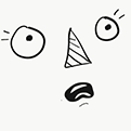
Usually, I'm a sucker for designs that are laid out around a big picture, but in this case, I like your "01" design better. It's a super clean layout that does a great job using proximity and margins to establish a shape that isn't there. Just really great margin uses. The column layout divides your content into "silos" that break it up and allow the user to precisely target what information they want. Your icons do a great job of quickly summarizing what each column is about so users can make their choices at a glance. Your navigation is large and easy to see/use. The image area is nice and big too, so you can put in a dominant image or slideshow quickly and tell the story of your business visually. I like your placeholder image, it shows off both the business and the product in one shot. Efficient! A grid design like this one is super easy to convert into a mobile design too.
I think some subtle gradients, particularly in the blue background, would be the final touch this thing needs. Perhaps a light drop shadow under the white top bar as well.
I would have liked to have seen mobile versions of these, but good work on your computer designs.
"Inspiration is for amateurs. The rest of us just show up and get to work." — Chuck Close
Michael Ganschow-Green - GRC 175 Instructor
mganschow@tmcc.edu | 673-8200 ext.5-2173
Michael Ganschow-Green - GRC 175 Instructor
mganschow@tmcc.edu | 673-8200 ext.5-2173
-
tweetysmurf2350
- Posts: 103
- Joined: Mon Aug 27, 2018 8:14 pm
Re: Prelim. #2
I like your second design more. It seems more interesting with the big picture of the person's face. Good Job!
Terri J. Taber
"Happiness can be found in even the darkest of times, if one only remembers to turn on the light." - Albus Dumbledore
"Happiness can be found in even the darkest of times, if one only remembers to turn on the light." - Albus Dumbledore
-
jason_hosier

- Posts: 109
- Joined: Mon Aug 27, 2018 6:21 pm
Re: Prelim. #2
idk why but the empty space in the header of your first design really draws my eye. it is just big. and empty.
"Any law that cannot bend in a storm is destined to be broken."
Re: Prelim. #2
I'm digging the large eye image. The first page feels more traditional and orderly. I like the buttons you choose. Perhaps play with the header and fill up that space a tish? Nice trust worthy blue btw!
-
evexhouses

- Posts: 85
- Joined: Mon Aug 27, 2018 6:24 pm
Re: Prelim. #2
I really like the one with the eye! The image makes the website look very clean and modern! A good mood for an eye doctor!
~"Graphic Design is my passion" -idk
-Evelyn Lopez
-Evelyn Lopez
-
Stasiavous

- Posts: 93
- Joined: Mon Aug 27, 2018 6:25 pm
- Contact:
Re: Prelim. #2
I really like both of your designs, but I think I like the 01 design better. It's laid out nicely, the icons you used are awesome and it looks super professional! Great job!
Staci Wilson
"I used to think I was indecisive, but now I'm not too sure" -Not too sure
"I used to think I was indecisive, but now I'm not too sure" -Not too sure