[Final Critique] Project 2
Posted: Fri Nov 10, 2017 6:39 pm
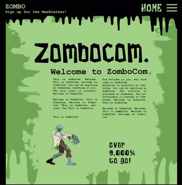
Hello! My websites are mostly finished, but I was desiring to hear feedback from this critique before I finalized them and made them live, so as to have less changes to make later.
I went with the mostly green design, as it was the popular choice and I felt that the friendlier spirit of it was more fitting than the creepy red design, though that one was cool too.
For the changes I made, I rearranged the type a bit, added texture to the plain background and header bar, made the nav bar horizontal, and added a forever loading gif. My goal was to make it more interesting visually, while still being in theme of very light horror and having some facet of memes.
To see the gif in action, there's an attachment or you can view it here:
https://i.gyazo.com/e0bd76837f742c0cca2 ... 7d258d.gif
I recommend the attachment, as it's a more accurate representation than the above link, though the quality is lowered in both.