
project2 preliminary critique
-
rmiyashiro
- Posts: 70
- Joined: Wed Jan 27, 2016 11:58 am
project2 preliminary critique
This is my first set of roughs for project2. I tried to go with their color scheme. I'm not sure the circles at the bottom work with it, but I added 'em for a bit o' humor.
This is my second set. I went with different colors and a centered home page.
My research for this project led me to the conclusion that roller skating is/was/will never be cool. Nonetheless, I will still roller skate (Sk8r4life!!!!). I put Roller Kingdom's commercial (https://www.youtube.com/watch?v=t0LSkX46dS4) on both home pages because I think it's funny and you should too. I'm not wholly in love with either design right now, but I'm leaning towards rough2.
Ryan 'Danger' Miyashiro

Re: project2 preliminary critique
Ry McD,
While I like both your designs, I definitely think the second design is better than the first one. It has a more vintage, 70s feel, which is good for roller skating. I like the video being embedded as well. The roller skate on top of the header is nice as well. Maybe think about adding some color or something, something fun and vintage. Right now it's too dark, which isn't very inviting.
Also, roller skating is cool, don't h8.
Lauren Solinger
-
dzynecin88
- Posts: 104
- Joined: Mon Aug 24, 2015 8:19 pm
Re: project2 preliminary critique
I like your second set of roughs with the roller skates on the homepage. I think it would be a bit more inviting if you had images of kids and families skating, birthday parties, etc. instead of using that space for the video on the homepage. I don't have a problem with including the video, just think it would be appropriate as a smaller link. I like your font choice for the company name, as well.
Cindy Salyer
-
Ryan_Hartman

- Posts: 23
- Joined: Thu Jan 28, 2016 6:47 pm
Re: project2 preliminary critique
The first design has more of a design i'd see at the Roller Kingdom verses the second design seems for fitting for a more adult rollerskating establishment. The Roller Kingdom is more of a kid friendly environment so i'd consider brighter colors or party type background that would compliment the foreground, probably something with a bluish-gray tint. The signs are very bold and establish a safe environment for children which is great.
-
Instructor

- Site Admin
- Posts: 1869
- Joined: Thu Jul 21, 2011 8:51 am
Re: project2 preliminary critique
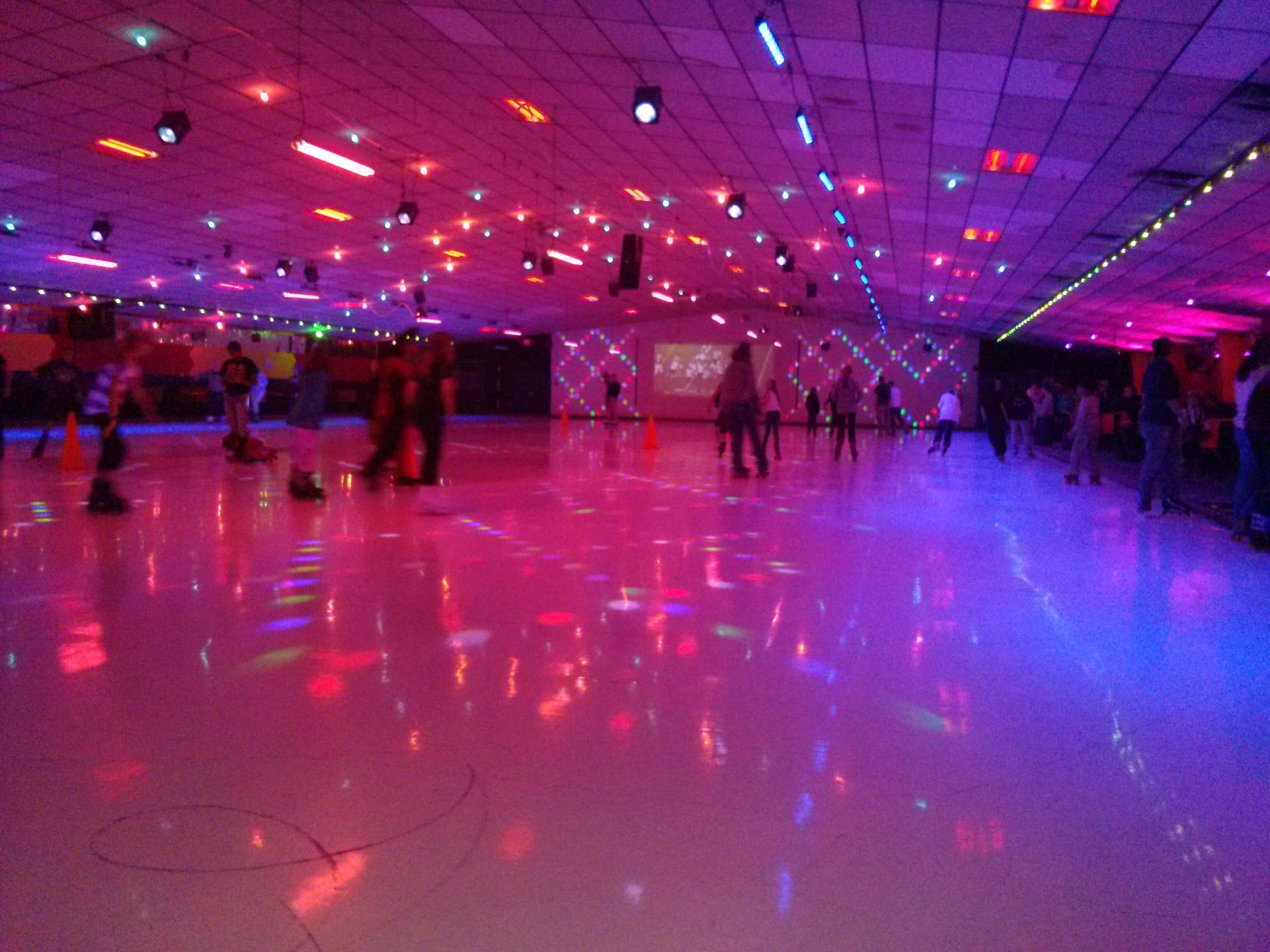
Heh. Lol. That's a great commercial. Always fun to see a Rhett and Link ad. I have to correct you though, roller skating was tres cool in the '70s. Now it's kitschy in a kind of retro way. In between though? Deeply uncool. I'm too old to care about cool though. Do what you like and get off my lawn! 
Roller Kingdom got a big redo in the '80s and has sort of never left. I'd say that makes your first design the winner. It uses their color scheme in a bright, period correct way. It uses contrast almost perfectly with the black background allowing the colors and images to pop out. The navigation is large and easy to use. Typographically, it's very strong as well. That logo font in particular is very '80s. The commonality between the pages works pretty well too. You've got a medium sized content area that you can throw in whatever layout you want.
If anything it's isn't colorful enough. I'd use gradients all over the design to make it look like it's on the wall of a darkened skating rink with colored lights being shined on it. Like here, here, and here. Don't mess up the great contrast too much though. Also make sure your "facebooks" and "dealsnapt" links are on the same baseline. And widen your nav a little bit, "Skate Shop" seems a little crowded.
Nice work, Ryan. Let's see it in action.
"Inspiration is for amateurs. The rest of us just show up and get to work." — Chuck Close
Michael Ganschow-Green - GRC 175 Instructor
mganschow@tmcc.edu | 673-8200 ext.5-2173
Michael Ganschow-Green - GRC 175 Instructor
mganschow@tmcc.edu | 673-8200 ext.5-2173
-
kaycee_weddell
- Posts: 73
- Joined: Tue Jan 26, 2016 6:41 pm
Re: project2 preliminary critique
Good job Ryan! I really like your ideas for Roller Kingdom. Their site wasn't the greatest and I am really enjoying your second design with the centered home page. It does have a very 70's retro vibe going on and I agree with Loren. It works great for roller skating! I like how you incorporated your imagery as well. I think I like the left alignment on your second page more than the center on the home page so maybe just play around with that.
Kaycee Weddell
-
ravens.way
- Posts: 83
- Joined: Thu Jan 28, 2016 3:30 pm
Re: project2 preliminary critique
Your second design stands out the most to me. I like the fonts and colors you used on both of your designs.
Gwendolyn Jones-Gailey

Re: project2 preliminary critique
I like your first design best, I like the bright colors and contrast and graphic nature of it. I think the second one is dark, and maybe too 'adult' looking for a place that caters to kids mostly. I might move the video to a different page, and use that space for something that is instantly recognizable as skating related, I'm not sure what. Maybe a picture of people skating or something. I love the font in the title. I'm not sure about the circles either, I don't mind them, until I get to the 'unplanned pregnancy' one. I'm not sure the connotations of that are what parents want to see when they're planning to drop their kids off at the skating rink 
Kirsten Sorensen
-
Joe_Morales

- Posts: 46
- Joined: Tue Jan 26, 2016 6:52 pm
Re: project2 preliminary critique
your brightly colored one is definitely the one you should go with its fun and appropriate for roller kingdom from what I remember of going there. you don't really need the no guns,drugs, and gangs circles as they do distract from the fun side of roller kingdom which is kinda the goal. looking good tho ryan.
Joseph Morales
-
dazey_duck
- Posts: 43
- Joined: Sat Jan 30, 2016 11:19 am
Re: project2 preliminary critique
I really like both of your designs as both of them communicate the essence of roller kingdom...just you know...nicer looking...and cleaner. That being said I think you should mesh the two together, I like you type in the second design and your color in the first.
Kaylyn Dazey
GRC Student at TMCC
GRC Student at TMCC