I like the first one with color. You may want to work on a better way to notify the user which page they are currently on, i think you are trying to do that with the grey link color but with all the other links a diferent color it doesnt stand out as much as I think it could. Other than that I think it looks great.
Oooh, three good ones! I'll go over them in order.
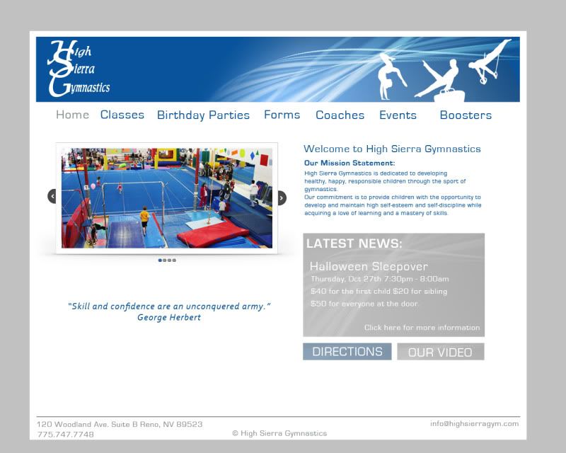
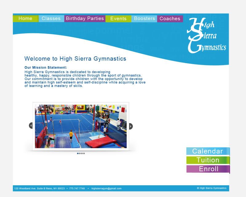
Design 1 - A very strong, clean, easy to maintain, design. I can immediately tell where I am and what I am doing on the site. Everything is immaculate and generally well laid out. Good content positioning and imagery throughout. I like the usage of the swoop as a repeating element in various pieces. Good clean navigation that immediately tells me where I am on the website and what I'm doing. My only issue with this one is the layout of the footer. It seems too scattered to me. I'd put all the contact info on one line and center it. Then put the copyright info on one line and center that. I'd then shrink both down a little (contact info by one size, copyright by two or three). Also, watch your margins along the bottom, it get's a little tight around the phone number. I'd take the footer from the second design and add it in this one with a similar marging around the edge of the footer as you have on the header.
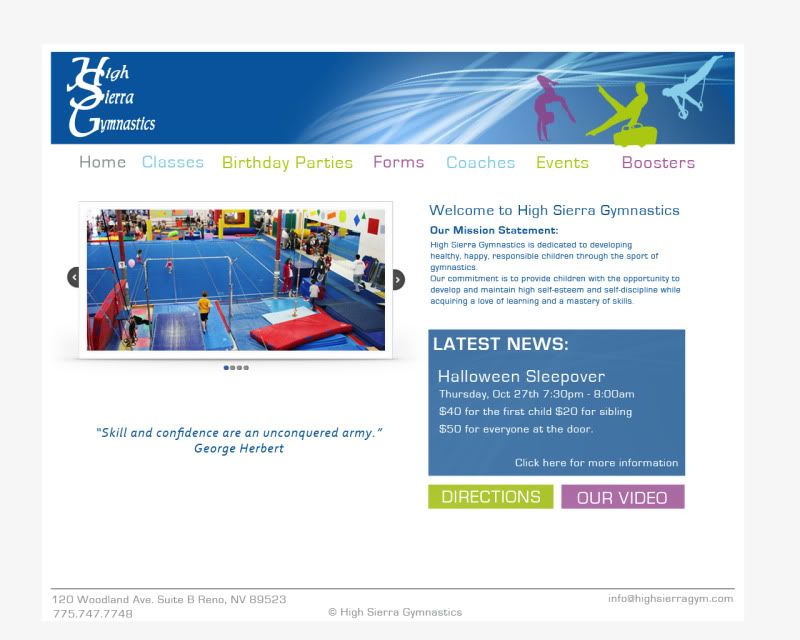
Design 1 with color - Very interesting. The added colors clash a bit with the cleanliness of the first design. The brightness of them makes the information and footer kind of recede a bit and the multi-colored navigation is difficult to follow. The colors lead my eye all over the place. Not sold on this one at all.
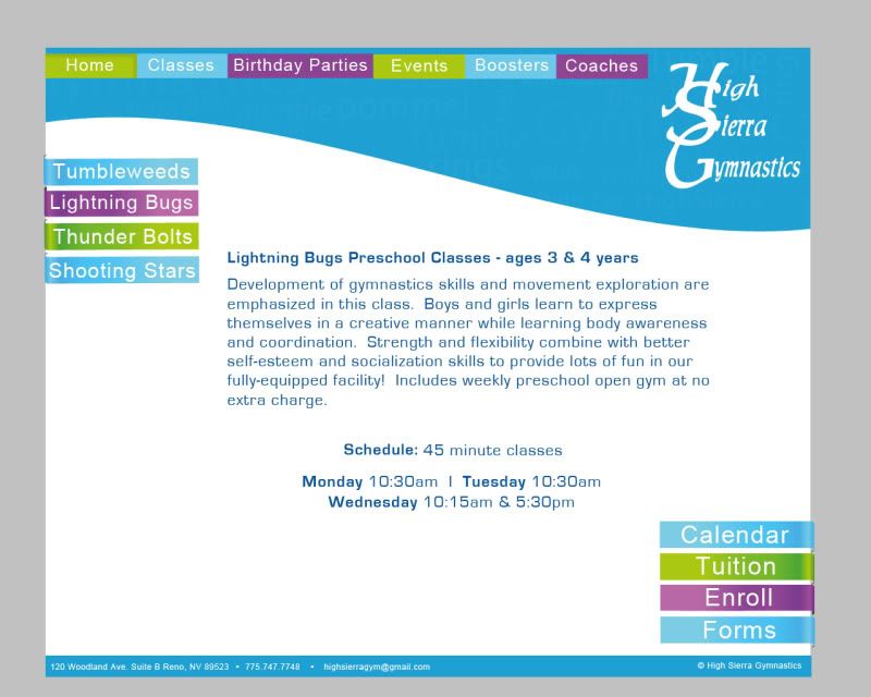
Design 2 - This one uses the multi-colors much better than the modified first design. I like some of the ideas you're throwing around here. In particular the swoosh across the top and daring to put the logo on the right, rather than the left. I also like the buttons that break out of the edge of your composition and the metallic gloss you applied to your buttons. The informational layout is not quite as strong as the very first design. Its tough to lay out around a swoosh without messing with informational or navigational hierarchies. It seems to lack the flow and ease of processing that the first design has. However this design has the best footer of them all. Steal this footer and put it on the first design!
Overall, I'd say go with the first one. It's clean, well laid out, and easy to navigate.
"Inspiration is for amateurs. The rest of us just show up and get to work." — Chuck Close
Michael Ganschow-Green - GRC 175 Instructor mganschow@tmcc.edu | 673-8200 ext.5-2173
Nice! I love the banner on the first rough, it captures the idea of fluid movement. This is the gymnastics place were I drive my friend's son to on thursdays. I'm curious as to what the original website looks like now.
Oh good to hear. I love the first one too.. I will take that idea and move the footer after crit tomorrow!
Kathleen, My son went there and my little brother did as well. Their site is so horrendous. I linked to it at the top. Maybe If Im lucky I can do a swap with them.. ill do the site and they let my kid do gym..( I cant afford it otherwise, but hes got the talent)
I can only hope..haha
But ya..keep the crits coming.. I want to blow this one up!
~Brianne Porterfield "What a crazy random happenstance!"