
For project 3, we are to design two concepts to promote the Graphic Communications Program at TMCC.
My first set of roughs are mixture of photo and splatters spots. I wanted to show a mixture of professionalism (with the photos) and artist flare together (ink splatter patterns). I chose eroded font for the headline and arial for body copy to make it readable.
For my second set of roughs, I went a little more colorful and font dynamic. Green and yellow, with blue buttons. It's a lot to take in and observe, but isn't that what the graphic program is all about?
Project 3 - roughs
-
rrodriguez

- Posts: 87
- Joined: Wed Sep 03, 2014 6:34 pm
Project 3 - roughs
- Attachments
-
-
-
-
"Something profound and awesome here and here and here..."– Rosa Rodriguez
Re: Project 3 - roughs
Hi Rosa!
Wow girl, these designs are awesome! Rough #2, has a bright & cheery color scheme that goes well together (it really stands out...and is very creative) and the imagery that you used is visually appealing, also. But I think I'm leaning more towards rough #1 because the layout is clean, simplistic, professional & creatively artistic. Your logo is eye catching and very creative (I love it! . The typography that you used is easy to read and goes really well together. I love your splatter spots it really adds character to the design, nice touch! The one thing I would suggestion is to make your content type and box a little bigger. Good Job!
Wow girl, these designs are awesome!
Danielle Record
Re: Project 3 - roughs
Hi Rosa, both of your designs are great! I am really drawn to rough 1, it's very clean and professional. I agree that the text box should be bigger. I love the sliced images in your design! Great start!
PaulaBurris
-
lingling_chen
- Posts: 39
- Joined: Fri Aug 29, 2014 10:52 am
Re: Project 3 - roughs
Wow,Rosa!
I think they are cool!!!
I like them all! If I have to choose one, I will choose your rough1 on the top, very nice on photo effect, type choice, layout, composition,department logo and details.
You sure did a wonderful job on this preliminary critique of this project. Can't wait to see the final of yours.
Good night
Lingling
-
Sierragirlnv

- Posts: 96
- Joined: Thu Aug 28, 2014 5:35 pm
Re: Project 3 - roughs
Hi Rosa,
I really like your rough layout ideas. I don't know what it is about the architecture of the skylights but I have seen it in so many photos, and designs. I really like the color scheme you have in the first layout. The way you collaged the picture together and the way it bleeds off the edge is a great design. I am wondering if you will use the same photo for all of the pages or change that to give each page its own unique identity.
sierragirlnv
-
georgia_novotny
- Posts: 79
- Joined: Thu Aug 28, 2014 5:46 pm
Re: Project 3 - roughs
Hi Rosa,
Great job on both your designs they look so professional!
I like both of them and think either one would work.
I like the rough 2 designs just a little more than rough 1.
Even though their almost tied for awesomeness!
I like the creativeness and the colors you have going, it more exciting.
I think these are my fav so far!
Great Job,
Georgia
Re: Project 3 - roughs
Hey Rosa,
I think both designs are strong, but I like the top set because the content is easier to take in. I would move the logo if you decide to go with that design though. I feel like it's oddly placed in the middle.
I think both designs are strong, but I like the top set because the content is easier to take in. I would move the logo if you decide to go with that design though. I feel like it's oddly placed in the middle.
Dominique Boudinot
Re: Project 3 - roughs
I enjoyed both designs.
Personally, I like the rough 1.
It's very professional design.
I also like the font.
But, I feel the background photo doesn't represents GRC program.
Also, you can play with the position of TMCC logo more.
Other than that, good job!
Kiwako
Personally, I like the rough 1.
It's very professional design.
I also like the font.
But, I feel the background photo doesn't represents GRC program.
Also, you can play with the position of TMCC logo more.
Other than that, good job!
Kiwako
-
Instructor

- Site Admin
- Posts: 1869
- Joined: Thu Jul 21, 2011 8:51 am
Re: Project 3 - roughs
Wow. Great set of layouts here, Rosa.
I like the first one a little better, mostly because of it's contrast. The grunge ethic behind it is really working well. I love the splatter textures and distressed font. The picture choice is working well and seems to compliment the grunge feel. On the inner page you have a nice use of semi-transparency with great margins on your type box. Your navigation is large and easy to follow. And did I mention the excellent use of contrast thoughout.
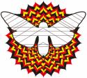
I'd recommend moving the class info and copyright down a notch to give it a little space from the main body of the design. The TMCC logo seems plopped in there. I would like to see it removed from the black box and worked into the design a bit more. Perhaps somewhere up top? I'm also not sold on the radiation logo for the GRC program, maybe because the red clashes with so much in the design, or maybe becuase of the implications of having a radiation symbol represent the program.
Excellent work! I want to see this as a real website.
I like the first one a little better, mostly because of it's contrast. The grunge ethic behind it is really working well. I love the splatter textures and distressed font. The picture choice is working well and seems to compliment the grunge feel. On the inner page you have a nice use of semi-transparency with great margins on your type box. Your navigation is large and easy to follow. And did I mention the excellent use of contrast thoughout.
I'd recommend moving the class info and copyright down a notch to give it a little space from the main body of the design. The TMCC logo seems plopped in there. I would like to see it removed from the black box and worked into the design a bit more. Perhaps somewhere up top? I'm also not sold on the radiation logo for the GRC program, maybe because the red clashes with so much in the design, or maybe becuase of the implications of having a radiation symbol represent the program.
Excellent work! I want to see this as a real website.
"Inspiration is for amateurs. The rest of us just show up and get to work." — Chuck Close
Michael Ganschow-Green - GRC 175 Instructor
mganschow@tmcc.edu | 673-8200 ext.5-2173
Michael Ganschow-Green - GRC 175 Instructor
mganschow@tmcc.edu | 673-8200 ext.5-2173
-
schakarun714
- Posts: 53
- Joined: Thu Aug 28, 2014 5:41 pm
Re: Project 3 - roughs
Yo Rosa these are some bad ass looking layouts. They are both really great to look at but i think the first white layout is working a little bit better. I like the patterns you threw on there. This looks like your style.
Shalie C. Forever Dreaming