
http://grc175.com/student/fall_2011/carrie_rogers/
Project 1 -Carrie Rogers

Re: FINALLY!
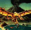
Looks good. I love the navigation font and color. My only gripe is the background image of water doesnt seem to go with the site. I think it could have been cool to keep that wall papery look and drop the water but if its there for a reason then ill just shut up. Otherwise i like the site and really enjoyed your navigation.
Kyle Smith
-
Rogers_Neighborhood
- Posts: 27
- Joined: Tue Aug 30, 2011 5:58 pm
Re: FINALLY!
Thank you and yeah I agree the water image is just there, will be getting rid of it!
Carrie Rogers
-
zelouzelou

- Posts: 63
- Joined: Mon Aug 29, 2011 7:22 pm
Re: FINALLY!
I love the water image that you used! The purple reflection on the waters is beautiful.
Kathyleen Bullard
-
Rogers_Neighborhood
- Posts: 27
- Joined: Tue Aug 30, 2011 5:58 pm
Project 1 -Carrie Rogers
Carrie Rogers
Re: Project 1 -Carrie Rogers
I love this site. Black and orange are good colors for this season with Halloween coming up. They were also my high school's school colors.
I love your site with the water and with the colors on the water you can tell there's lights reflecting on it... but you didn't show the buildings or whatever is shining the lights. I like that, it has a feeling of mystery, makes me wonder what it is, and also adds an artistic aspect to the site.
I think you did a wonderful job on it.
- Nathan Lundholm
-
brienicole

- Posts: 132
- Joined: Mon Aug 29, 2011 5:02 pm
- Location: Sparks, Nevada
Re: Project 1 -Carrie Rogers
I like both the wallpaper and the lake image..just not together. Id pick one or the other. Also your tmcc logo looks a bit too compressed. (aka blurry)
~Brianne Porterfield
"What a crazy random happenstance!"
"What a crazy random happenstance!"

Re: Project 1 -Carrie Rogers
Your transparent look through the text to the water works very well. Love the glow on the water. I want to make the background image a little brighter, but I am someone with old eyes. I want everything to look brighter. The water is actually fine, it is the wallpaper that I can’t quite see.
The biggest suggestion is the body copy. I would indent it. I am not sure your first sentence is working properly either. The subject seems to be missing… just put a comma after Nevada, and insert your name.
Otherwise, I think you have a real neat effect on your site!
The biggest suggestion is the body copy. I would indent it. I am not sure your first sentence is working properly either. The subject seems to be missing… just put a comma after Nevada, and insert your name.
Otherwise, I think you have a real neat effect on your site!
Arlene Williams
Old dragons get tired but they can still flame. Beware!
Old dragons get tired but they can still flame. Beware!

Re: Project 1 -Carrie Rogers
great concept, i agree with every one who mentioned that you need to go with either the water, or the wallpaper look. personally, i would go with the wallpaper look, give it just a little more contrast, then make it look really old and have it fade somehow into the black background.i think that could be a really cool concept. i also think a font more like this one http://www.dafont.com/before-the-rain.f ... +1&psize=l would work better and maybe make increase the font size and have the letters overlapping the yellow lines you have in there.
i think you have a really cool concept and i can't wait to see what you do with it.
i think you have a really cool concept and i can't wait to see what you do with it.
David Bjerre
I found sand!
I found sand!
Re: Project 1 -Carrie Rogers
So, I agree the water/wallpaper combo doesn't "make sense" but.... I still like the effect. I'm not actually sure why, since, like I said, it doesn't "make sense".  Also, some rollovers might be cool for your nav links. But I like it. Good job.
This post has been brought to you by the letter X, the number 5, and Larry Rubald.
"It's irony at a base level, but I like it." ~Bill Hicks
"It's irony at a base level, but I like it." ~Bill Hicks