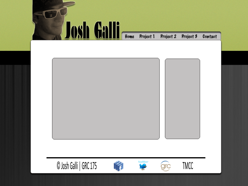
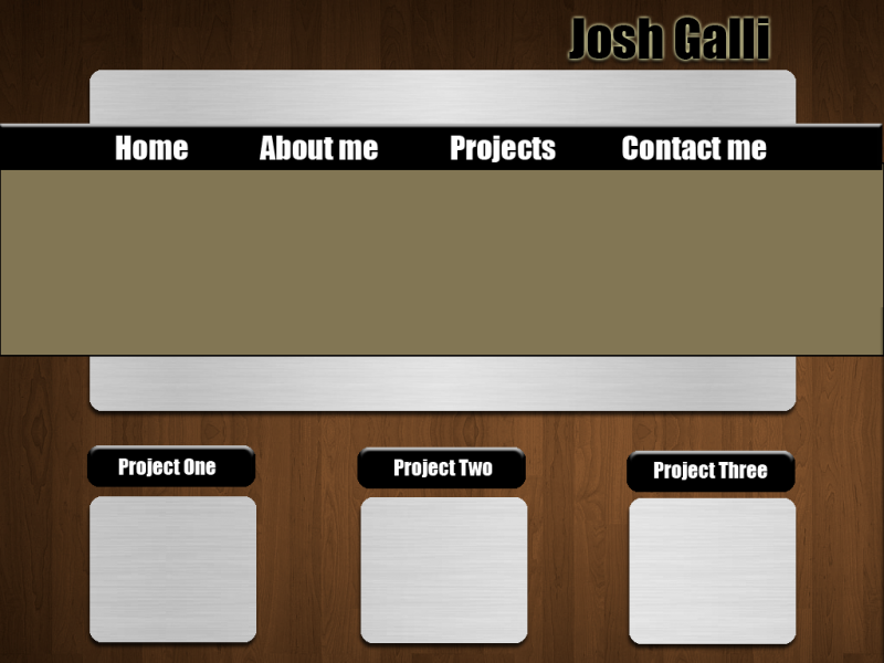
I was one of the few students who were unable to present last monday due to all of you taking too long! Just kidding, but Michael asked me to throw my roughs up here to get a little feedback in the mean time. They definitely need some tweaking and some different color choices in my opinion, but here they are:
I think your going in good directions with both actually. Im not a fan of rounded boxed corners, but that's a matter of personal opinion. I like the wood grain against the metal grain on the second one.. you could definitely go in a cool direction with that idea.. nature Vs. Man Made etc..
~Brianne Porterfield "What a crazy random happenstance!"
I agree with Bri that you have two great designs, but my preference is with the first. I like where you put your picture, and I like how your main body and tabs resemble a file folder. It is a less cluttered appearance to me. But you could definitely work in the textures of the second one into this design.
I think with the first rough, the only thing that bothers me alittle is the vertical emphasis on fonts you chose for your title (name) and the footer info (copyright, TMCC, etc) I just feel like it looks stretched out.
I think I like the second rough more, but maybe you could bring in a small amount of a bright contrasting color like blue or orange. The color scheme is almost monochromatic and I think it would give it more visual interest.
Yea, I definitely don't like the font I stuck on there for the first one. I agree it's way to stretched looking and it will definitely be changed. Thanks for the feedback everyone, I appreciate it.