
Hello!
I like the second set- the grey of the nav bar gives it a nice weight and frames the content. I think the bar could be made a lot thinner, as there's lots of space around the text.
Project 4 Preliminary
-
Fear The Deer
- Posts: 70
- Joined: Tue Sep 03, 2019 5:06 pm
Re: Project 4 Preliminary
Jessica Laughead
Re: Project 4 Preliminary
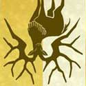
The first layout seemed the most representative of the TMCC atmosphere with the image of the school mascot. The second layout seems too similar to the current site in my opinion. Considering the first layout is more fun and engaging, I would hope to see more done there. Thanks.
Tandy G
GRC 175, Web Design and Publishing I, Fall 2019
Truckee Meadows Community College
GRC 175, Web Design and Publishing I, Fall 2019
Truckee Meadows Community College
-
Sugar_/\ppul
- Posts: 53
- Joined: Mon Aug 26, 2019 5:48 pm
Re: Project 4 Preliminary
Nice designs you have here, they all seem neat and easy to navigate. The dark colored header is much more preferable as the text and logo just POPS! Nice images you got.
~ Jessie Alanis 