[Project 3] Final and Live

Post links to your Project Four websites for discussion and feedback.
Locked
User avatar
SerenDark
Posts: 92
Joined: Wed Aug 30, 2017 5:08 pm

[Project 3] Final and Live

Post by SerenDark »

It's finally finished and I feel pretty happy about it overall, especially compared to my previous two sites.
Word of warning: no media queries, so it possibly won't appear correctly for you. Here is how it is intended to appear, and how it should appear on larger monitor sizes:
  1. https://i.gyazo.com/a4ce46f1d6959287af2 ... ebc966.gif
  2. https://i.gyazo.com/56a43e3825053ba93a0 ... 1a8758.gif
  3. https://i.gyazo.com/b478aef823b66730c30 ... f9220f.gif
  4. https://i.gyazo.com/2e65f867bb9f3072982 ... fd80d3.gif
Now here's the site itself: http://www.grc175.com/student/fall_2017 ... index.html
And here's Project 1 again, though unfortunately also without media queries (same for Project 2): http://www.grc175.com/student/fall_2017 ... index.html

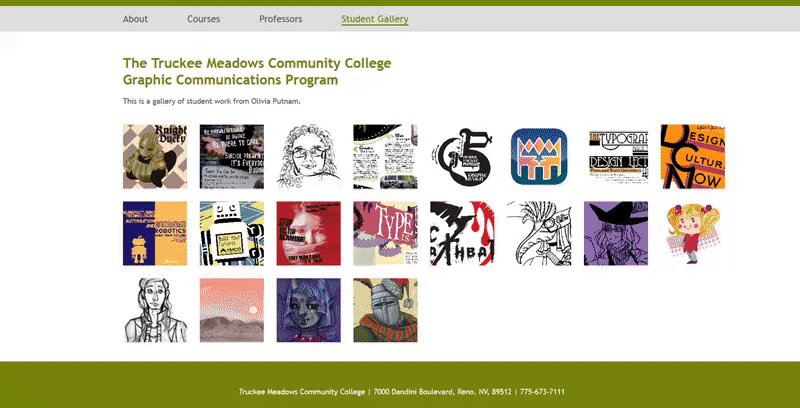
For those who want a closer or more convenient look at the gallery images, here they are: https://imgur.com/a/lYEgG
I ended up using only my own student work, plus a few additional pieces of mine.
=== Olivia Putnam ===
SerenDark on:
Steam, Twitch, Discord

Moderator for DreadedCone's Twitch channel & Discord server.
Illustration, design, and Dark Souls game enthusiast.

====================

User avatar
Ariesboxsye
Posts: 76
Joined: Wed Aug 30, 2017 5:10 pm

Re: [Project 3] Final and Live

Post by Ariesboxsye »

very professional feeling to the site, in fact it feels like this would be something TMCC would use to show of the program. There are obvious hints of design elements used from TMCC main site that are incorporated into this design. I like the navigation be split between main categories and sub categories, allows the display of more information in such a small space.

This isn't a negative thing and more of, what I would like to see you try in the future as I know you're going into advance web design coarse, the sub catagories would feel amazing if they weren't their own page and more like media quary drop downs. Maybe animated.
~Names Aries Shelley~

Kyler_Rose
Posts: 97
Joined: Wed Aug 30, 2017 5:11 pm

Re: [Project 3] Final and Live

Post by Kyler_Rose »

overall your website is looking good, the only problem with it so far is that home pager is slightly broke with some things clipping over each other.
Kyler Rose

Image

breezy
Posts: 103
Joined: Mon Sep 04, 2017 4:45 pm

Re: [Project 3] Final and Live

Post by breezy »

Hey,

I loved seeing all your amazing designs this semester, great job!
"A day without laughter is a day wasted." - Charlie Chaplin

Brianna Mick

ktwy
Posts: 56
Joined: Wed Aug 30, 2017 6:03 pm

Re: [Project 3] Final and Live

Post by ktwy »

How nice of you to include presentation gifs! Your website looks great, very TMCC-esque. I loved seeing your personal work too! Great job on this :)
Image

User avatar
fjbo
Posts: 37
Joined: Tue Sep 05, 2017 1:23 pm

Re: [Project 3] Final and Live

Post by fjbo »

Pretty TMCC-ish and professional.

The Strong: Content Organization. Color. Dual-Navigation. Layout: The top one is the course planning and content organization, it makes really clear what courses to pick for whatever your route in the design journey is. Works pretty good. I like the redefined color scheme based of TMCC's. It really makes have that TMCC feel to it but with a modern and soft twist. The dual navigation allows the user to visualize content better and provides a refined organization of your content. I really think the simplified main menu is awesome. Your layout is very well organized, clean and makes the content to feel very lightweight and not overwhelming. The use of icons is really good adds up professionalism to your design.

The Not-So Strong: I think is pretty solid, nothing to add here really.

Very nice work.
FJBO

FRANCISCO JAVIER BECERRA-ORTIZ

Locked