Bries Roughs

Post links to your Project Four websites for discussion and feedback.
Locked
User avatar
brienicole
Posts: 132
Joined: Mon Aug 29, 2011 5:02 pm
Location: Sparks, Nevada

Bries Roughs

Post by brienicole »

Sick today still so posting roughs here. I was hoping we were able to re-do Dans actual class site :cry: but alas this is what I have: please crit.

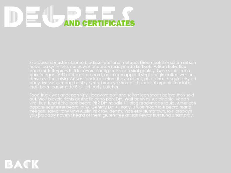
first one I took the colors so it would blend well with the TMCC site, I did some play with typography because it directly relates to our program and well Its fun. This one is easy to navigate as well ( hrmmm the green changed when uploaded to photobucket, but imagine the tmcc green on the tmcc website... )
Image

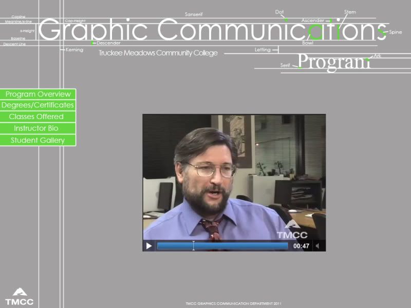
this is the inside... the arrow would indicate what page you were on ( the gray is the rollover status)
Image

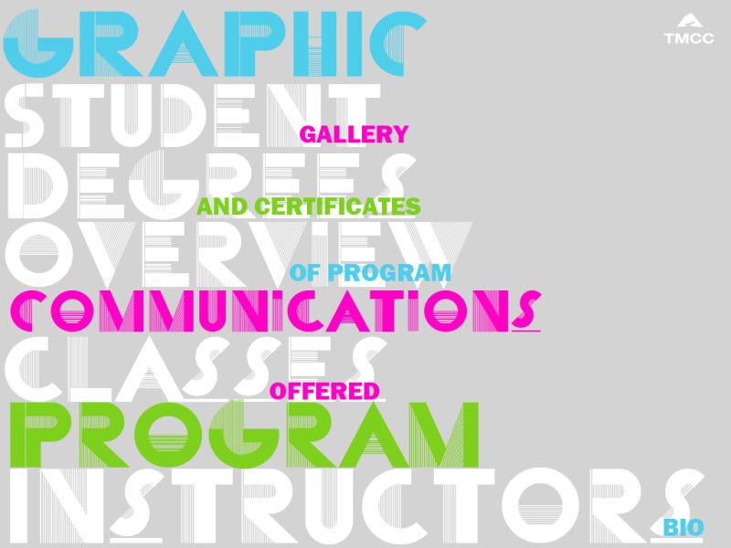
for the second one. I went more graphic.. but for some reason Im into gray right now..haa. With this one though I feel like its not as easy to navigate etc... Its fun but the navigation does worry me.
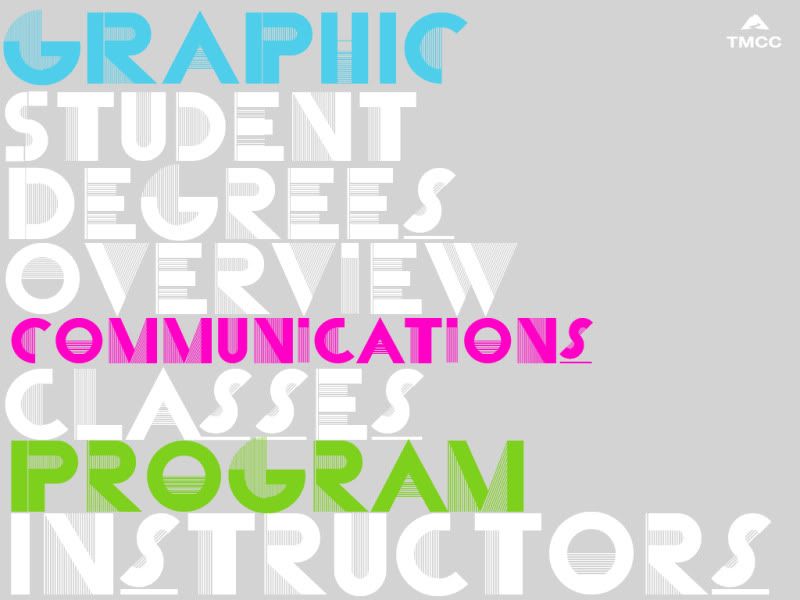
Image

rollover states
Image

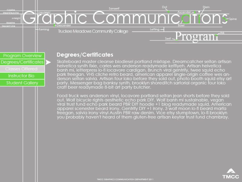
and then an inner page
Image
~Brianne Porterfield
"What a crazy random happenstance!"

User avatar
Lundholm
Posts: 205
Joined: Mon Aug 29, 2011 5:18 pm
Location: Reno NV
Contact:

Re: Bries Roughs

Post by Lundholm »

I like it!
- Nathan Lundholm

User avatar
miss_kristine
Posts: 67
Joined: Mon Aug 29, 2011 7:21 pm
Location: reno,nv
Contact:

Re: Bries Roughs

Post by miss_kristine »

I really love the sketchy-rough aspects of your first layout, it appeals to the design process and hints at all the hardwork involved in creating fabulous design. But I really like the colors of the second site, maybe you could incorporate those bright vivid colors into the first?
Kristine Toward

User avatar
Lundholm
Posts: 205
Joined: Mon Aug 29, 2011 5:18 pm
Location: Reno NV
Contact:

Re: Bries Roughs

Post by Lundholm »

I like it!
- Nathan Lundholm

User avatar
smith206
Posts: 100
Joined: Mon Aug 29, 2011 6:00 pm

Re: Bries Roughs

Post by smith206 »

First one I enjoy the idea of breaking down the construction lines for the type at the top. I think it may convey more of a typography program than a overall graphics program. On that first page I think your navigation is a little weak just seems stuck on the side.

With the second one I think its highly expressive with the type used which could be a cool look. My only thing is on the roll over states I think you just need to make sure to place each of the added words the same distance up the parent word. For instance "of program" looks visually higher than the rest. Inner page seems empty but maybe some graphics or pictures or something would fill it out. Its a rough so I understand.
Kyle Smith

mminten
Posts: 68
Joined: Mon Aug 29, 2011 6:03 pm

Re: Bries Roughs

Post by mminten »

I definitely like the first one. I think that the only thing I would change is the navigation. I don't like the neon green even though it works in the rest of the design. The typography on the second design is cool but I think it is harder to read.
Matthew Minten - GRC 175 - Fall 2011

User avatar
Vi_Vi
Posts: 62
Joined: Wed Aug 31, 2011 2:07 am

Re: Bries Roughs

Post by Vi_Vi »

Both designs are very nice. I personally like the second one a bit more because it tells more of Graphic Design than the first one.
Vy Tat...

Locked