
erika.murray,
Both designs are strong in terms of color combination and layout. The only thing i can say to improve on is to align and justify your type.
Jose Macias.
Project 1 - Preliminary
Re: Project 1 - Preliminary
Erika,
I like the first one better, one thing you might consider is to add some color into the design. The layout is very structured which I like but bringing color in would give it more visual interest. Great job on both!
I like the first one better, one thing you might consider is to add some color into the design. The layout is very structured which I like but bringing color in would give it more visual interest. Great job on both!
"A day without laughter is a day wasted." - Charlie Chaplin
Brianna Mick
Brianna Mick

Re: Project 1 - Preliminary
These are wonderful designs! I definitely prefer the first one.
My only issue with the first one is some of the spacing. What if you tried centering the "Project 2", "Project 3", and "Inspiration" labels within their spaces, instead of having them be slightly up higher as they are currently? I also feel like your block of body copy could use more breathing room around it.
My only issues with your second design are just how much the red-orange and green stand out from everything else. I would like to see a third element somewhere on the page with both colors (or a different element for each one), to help spread these oddball colors to accents that really bring the whole page together more.
=== Olivia Putnam ===
• SerenDark on:
→ Steam, Twitch, Discord
Moderator for DreadedCone's Twitch channel & Discord server.
Illustration, design, and Dark Souls game enthusiast.
====================
• SerenDark on:
→ Steam, Twitch, Discord
Moderator for DreadedCone's Twitch channel & Discord server.
Illustration, design, and Dark Souls game enthusiast.
====================

Re: Project 1 - Preliminary
Hi Erika!
Both of your designs are strong! I prefer the top one, "rough_2". It doesn't have as much color in it as the one with orange in it, but I think you could easily add color to the first one, rough_2. I like how you balanced the concert image with your name in squares, but try it with the letters inline for your name to be more readable. Overall your design is clean and balanced!
Both of your designs are strong! I prefer the top one, "rough_2". It doesn't have as much color in it as the one with orange in it, but I think you could easily add color to the first one, rough_2. I like how you balanced the concert image with your name in squares, but try it with the letters inline for your name to be more readable. Overall your design is clean and balanced!
Melissa Peel
-
Ltrueworthy
- Posts: 25
- Joined: Wed Aug 30, 2017 5:11 pm
Re: Project 1 - Preliminary
I think both layouts are great but i think I am leaning toward the top one with the picture of a band. I definitely think it is clean and everything is easy to find which makes websites so much better to navigate on.
My only comment is the placement and alignment of your name on the page. It seems like it is broken up so much that it might be harder to read but that might be just me. Besides that i really like, it looks clean and fresh
My only comment is the placement and alignment of your name on the page. It seems like it is broken up so much that it might be harder to read but that might be just me. Besides that i really like, it looks clean and fresh
Lea Trueworthy

-
Cassiebowers
- Posts: 56
- Joined: Wed Sep 06, 2017 12:13 pm
Re: Project 1 - Preliminary
Hi Erika,
I like your second design it is very uniform and organized. I like your color choice. Maybe put more red and green in other places to balance the colors.
I like your second design it is very uniform and organized. I like your color choice. Maybe put more red and green in other places to balance the colors.
Cassandra Bowers
-
Zera-Chann

- Posts: 57
- Joined: Wed Aug 30, 2017 5:04 pm
Re: Project 1 - Preliminary
Hey Erika!
I really like the colors of the first one and the easy navigation of the layout as well.
My only critique is remember to add the TMCC logo for requirements.
Can't wait to see the finished work!
I really like the colors of the first one and the easy navigation of the layout as well.
My only critique is remember to add the TMCC logo for requirements.
Can't wait to see the finished work!

-
CarnutianDragon

- Posts: 23
- Joined: Wed Aug 30, 2017 5:07 pm
Re: Project 1 - Preliminary
Hi Erika,
I really like your first design. Your use of large bold font as well as the interesting placement of your name really caught my eye. I also am really enjoying your use of bright blue and white, it gives off a fresh, new feeling. I would suggest placing your navigation else where since it feels like the placement and size of your buttons are a little hastily positioned.
Great work and I can't wait to see the finished product!
Sarah Alvarado

Re: Project 1 - Preliminary
I agree with you, the second layout feels stronger and playful:
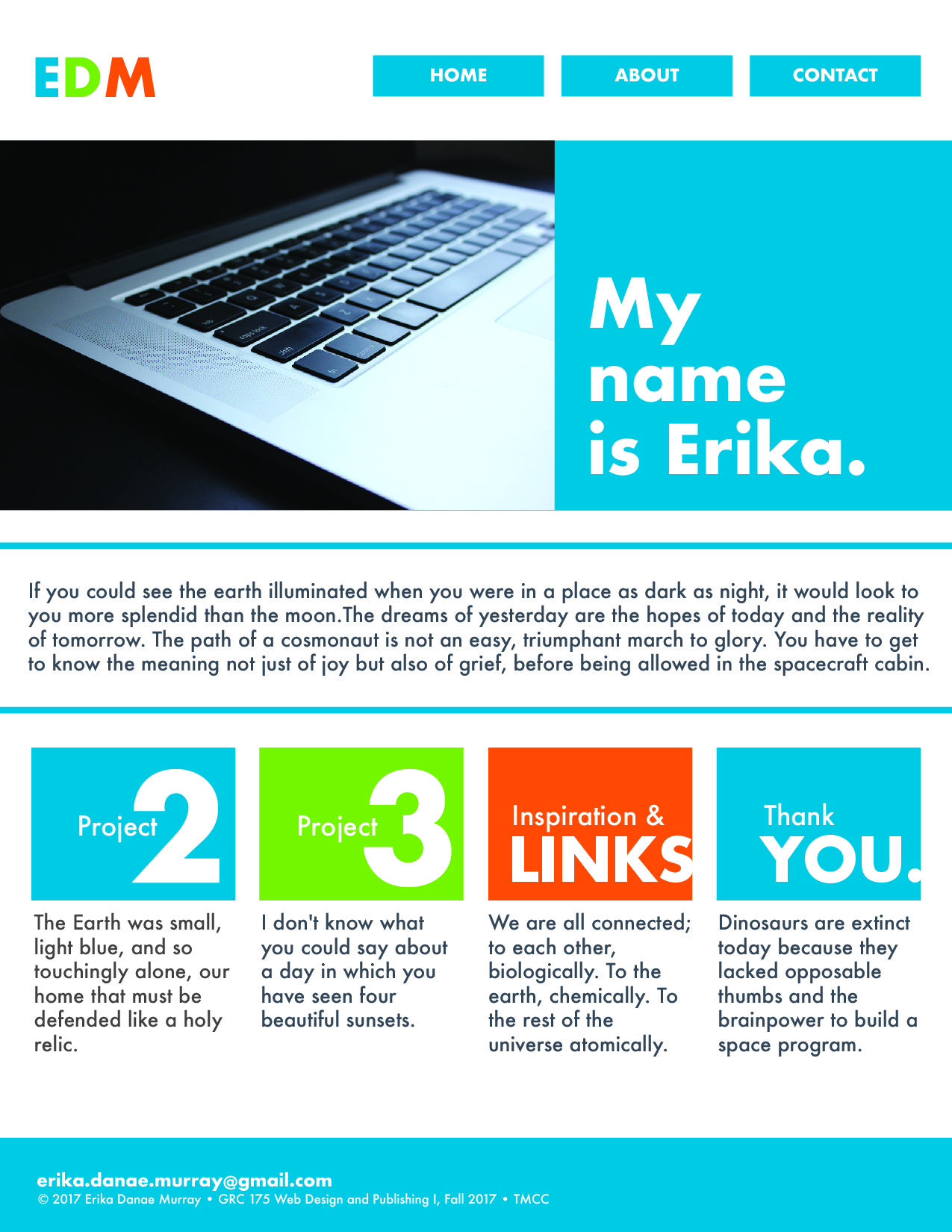
I like the stage/canvas/slider/etc on your first one though. It feels more personal. Speaking of which, I hope you don't take the following as a personal thing. I like where your design is heading in terms of organization and keeping what's important only. It's probably going to be a very superficial comment... but my impression from the few times that I have interacted with you is that you have a lot of personality that is left out from your designs. I apologize if this is a little too direct, but I feel that you could express more about who you are, what defines you and what inspires you as designer. I know it might be a little too early to point this out, but you should to tell who you are without relying just in the content.
On the bright side, colors are very harmonic and feel that you spend a little time working the palette out the values are great. It feels very professional in regards to the organization, hierarchy, unity and flow. Your typography is really interesting because it's not as obvious as many websites try to chug huge text down your eyes nowadays, yours it's pretty cool. Your typography says that you even think about the small details. Really good.
FJBO
FRANCISCO JAVIER BECERRA-ORTIZ
FRANCISCO JAVIER BECERRA-ORTIZ