
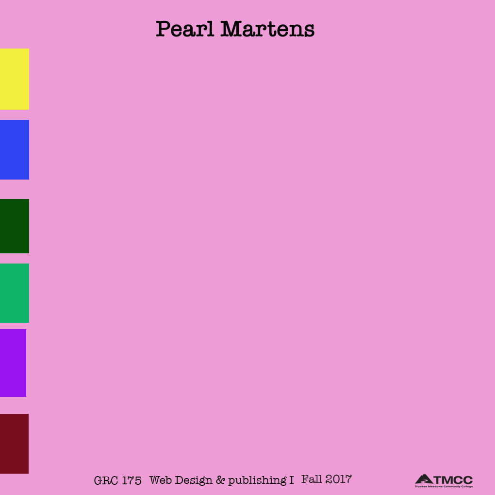
Hello, these are my two roughs. The first one is more of a office/file look. The tabs are where I would have my About Me, and Projects. A pretty simple straight to the point feel.
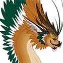
My second rough, is more me. The horseshoes are where I would have My Projects, and the blank space under the horse is where I would have the About Me info.
I really didn't have just one website I went to, the ideas were mine.
Project 1
-
Pearl_Underwood

- Posts: 63
- Joined: Wed Aug 30, 2017 5:29 pm
Project 1
- Attachments
-
- a tabbed file
-
- Horse
Last edited by Pearl_Underwood on Mon Sep 18, 2017 1:21 pm, edited 2 times in total.
~Pearl Underwood~
-
selvster5000
- Posts: 84
- Joined: Wed Aug 30, 2017 5:09 pm
Re: Project 1
aya pearl aye!!!
Love your horse theme, it's totally you. I also like how simplistic your design style is.
The second design is my personal favorite. I like the horse shoes above your picture!
Those would make great hidden links! I would def center them above the picture and
perhaps lighten the brown background so they stand out a bit more.
This is a good start!
Play around with the elements in your design a little more and you'll get there:)
Cheers,
Hannah Selvey
Hannah Selvey
-
chaytothet
- Posts: 91
- Joined: Wed Aug 30, 2017 5:08 pm
Re: Project 1
Hey ya Pearly!
I like where you're headed with these
I think you could do like a post it notes or something so we all, without a doubt, know that the color represents tabs! maybe a pen on top or something so it looks like it's sitting on a desk!
I love the type face you chose though reminds me of an old detective agency's filing system.
Design on!
I like where you're headed with these
I think you could do like a post it notes or something so we all, without a doubt, know that the color represents tabs! maybe a pen on top or something so it looks like it's sitting on a desk!
I love the type face you chose though
Design on!
-Chalyn
Just because my path is different doesn't mean I'm lost
-Gerard Abrams
Just because my path is different doesn't mean I'm lost
-Gerard Abrams
Re: Project 1
Hey,
I love your horse theme! It is very simple but effective. I love the horseshoes as buttons. Great idea!
I love your horse theme! It is very simple but effective. I love the horseshoes as buttons. Great idea!
Susie Lang

Re: Project 1
Okay I am going to be a little against the flow, but I think this design has a lot of potential:
I feel like the layout you are aiming for on this one is more out-of-the-box, which is best for a designer's website in my personal opinion.
I would say add horses to this design since there is a positive feedback from your horse theme, but play around with the layout you are trying to explore.
Have fun with your design!
FJBO
FRANCISCO JAVIER BECERRA-ORTIZ
FRANCISCO JAVIER BECERRA-ORTIZ
-
Instructor

- Site Admin
- Posts: 1869
- Joined: Thu Jul 21, 2011 8:51 am
Re: Project 1
Hmmmm. I think there are elements of both, that when mixed would make for a neat design.
I like the tabbed navigation from your first design. Those tabs would be really nice as the navigation on the horse design. I also prefer the placement and size of the GRC 175 text and TMCC logo (nice use of the black logo BTW). I think if you stole those two things and combined 'em with the horse layout, I think you'd really have something here. Maybe play with the type on the combined version as well. I'm not sure how well typewriter type would work on a horse themed page. I prefer the colors and framed layout you have on the horse design. I like the big, central picture of the horse and rider. It goes a long way to establishing a good theme. The overall design would look quite neat if you played around with some sort of background image. Perhaps a pattern of aged wood, or a leather texture, or some sort of landscape.
Good effort.
"Inspiration is for amateurs. The rest of us just show up and get to work." — Chuck Close
Michael Ganschow-Green - GRC 175 Instructor
mganschow@tmcc.edu | 673-8200 ext.5-2173
Michael Ganschow-Green - GRC 175 Instructor
mganschow@tmcc.edu | 673-8200 ext.5-2173
-
Ariesboxsye

- Posts: 76
- Joined: Wed Aug 30, 2017 5:10 pm
Re: Project 1
A nice start to the layouts of each, I feel bad giving input on missing items so I will only add that I like to see you play with the image of the horse and hope to see a unity through the entire design in the future.
~Names Aries Shelley~
-
CarnutianDragon
- Posts: 23
- Joined: Wed Aug 30, 2017 5:07 pm
Re: Project 1
Hi Pearl,
There isn't very much that I can give input on but I would say that you should go with your second design. I feel that it has the most potential out of the two. Your color is nice but maybe look up some color palettes to make your design pop more.
You have a nice start and I can't wait to see where you go with it!
Sarah Alvarado
-
Zera-Chann

- Posts: 57
- Joined: Wed Aug 30, 2017 5:04 pm
Re: Project 1
Hey Pearl!
There not much input i can give but i would say the second one has a bit more potential and it feels like you that's the direction you want to go with. Just play with colors and add text were you see fit.
Can't wait to see the finished project!
There not much input i can give but i would say the second one has a bit more potential and it feels like you that's the direction you want to go with. Just play with colors and add text were you see fit.
Can't wait to see the finished project!

-
Kyler_Rose
- Posts: 97
- Joined: Wed Aug 30, 2017 5:11 pm
Re: Project 1
Over View
Overall these templates are alittle hard to help you how to improve, they seem really unfinished and dont have to much detail to them. Between the two i would go with template 2 as it has a bite more work to go off compare to template 1.
Template 1
This template is realy to bare and im not sure what the colored boxes to the side are for. Are they for the nav bar, are they links or are they just there for design. This Template needs alot more work before i could really help on how to improve. Its missing alot of the required material for the assignment
Template 2
This Template is also hard to help you with, but has more design compared to template 1. So fare the space and positioning of the current elements is good, but you need to add the reast of the required material.
Sorry if this came out mean, Im just trying to give to be honest option on your work.
Kyler Rose
