
Project 3 Roughs
-
IvorHarvey

- Posts: 49
- Joined: Thu Jan 26, 2017 12:32 pm
Project 3 Roughs
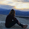
Here are the two concepts I came up with! One is more image based, and the second one I tried to stay close with the TMCC colors. For the one with the mountain range actual image, I want to to have a drop down menu that will appear when you scroll over the navigation up top.
- Attachments
-
-
-
-
Ivor Harvey
Re: Project 3 Roughs
Hello Ivor,
Very cool designs, as usual! I really like your "rough3", the fact that you preserved the green of TMCC creates unity with the tmcc.edu website but the look of your design is well done! I love the outline of the mountain, it's a little reminder of the amazing view we have from the campus without using any image. Perhaps, I would make the text in the navigation a little smaller and not as bold. Otherwise it looks great!
Very cool designs, as usual!
- Stephanie Kendziorski.
Re: Project 3 Roughs
Hey Ivor,
I like both of these ideas. I like the one with the actual image better than the green one for a couple reasons. I'm more drawn to photo based images and I thing the TMCC green is just gross... One suggestion I have is to keep your navigation consistent. On both of your designs, the nav is in a different place on each page. Great work!
I like both of these ideas. I like the one with the actual image better than the green one for a couple reasons. I'm more drawn to photo based images and I thing the TMCC green is just gross... One suggestion I have is to keep your navigation consistent. On both of your designs, the nav is in a different place on each page. Great work!
BreeAnn St.Onge
Re: Project 3 Roughs
Hi Ivor,
Both of your designs are great, although I would go with the your "rough 3" design.
Using the TMCC color scheme is visually appealing with the bright color scheme, it really
makes everything pop!
The navigation is much more appealing than the your other rough.
Just as Stephanie commented, you should make your navigation smaller, since it draws
much more than the actual content.
The Graphic Communications header in "rough2_page2" should have a bigger font.
Also, there doesn't seem to be a link to go back to the first page.
- Eduardo Garcia
Re: Project 3 Roughs
Hi Ivor,
On rough 2 how about keeping the nav bar horizontal? I think the box with the navigation is too big, it takes away from the cutout of the mountains which adds a nice look to the website. I could go either way but I think the one with the image is the one I am leaning towards. Maybe it will come down to which one you like.
On rough 2 how about keeping the nav bar horizontal? I think the box with the navigation is too big, it takes away from the cutout of the mountains which adds a nice look to the website. I could go either way but I think the one with the image is the one I am leaning towards. Maybe it will come down to which one you like.
Michele K Ott

Re: Project 3 Roughs
Hi Ivor,
I would go with the blue design. It is (once again from you) extremely visually pleasing. When I saw you somehow managed to make the desert floor blue, I was sold! It just so happens that I also think your blue design is more 'web-fun'. All of the navigation elements are not too big or too small. It looks and feels well proportioned. The green design would work better (for me as the person browsing) if the navigation was smaller. But both designs are very nice (go with the blue one! )
)
Nice work...again!
I would go with the blue design. It is (once again from you) extremely visually pleasing. When I saw you somehow managed to make the desert floor blue, I was sold! It just so happens that I also think your blue design is more 'web-fun'. All of the navigation elements are not too big or too small. It looks and feels well proportioned. The green design would work better (for me as the person browsing) if the navigation was smaller. But both designs are very nice (go with the blue one!
Nice work...again!

-
elizabeth_mccurdy
- Posts: 36
- Joined: Tue Jan 24, 2017 7:03 pm
Re: Project 3 Roughs
Hi Ivor,
Great work hard to decide because both design look great
  I would go with the blue design too. I like the view of the mountains and the organization and the color. All the organization, type and color get me excite to study and learn in here I don't know what to change but any design you choose I think will be great
Great work again!
Great work
Great work again!
Elizabeth McCurdy
-
Instructor

- Site Admin
- Posts: 1869
- Joined: Thu Jul 21, 2011 8:51 am
Re: Project 3 Roughs
Oooof, two really good designs here. I do admire the attempt to salvage TMCC's awful color scheme but go with your image based design.
I really do like the image based design. The imagery alone gives a great feel for the Truckee Meadows and what you might be in for if you attend TMCCs Graphic Communications program. I think that "Truckee Medows" sunrise text is such a strong visual element. Your type is perfectly chosen to go with the design and both inform readers and compliment the layout and imagery. Your navigation is well placed and easy to use. The bodycopy area is easy to read and has nice margins.
Your inner page does seem a little crowded though. I think some vertical margin between elements will give everything a little room to breathe, especially at the top. There's a rather obvious break in your image about three-quarters of the way down the page. You might want to smooth that out with a little bit of merciless photoshoppery.
These are outstanding, Ivor. I look forward to seeing your pictorial design constructed.
"Inspiration is for amateurs. The rest of us just show up and get to work." — Chuck Close
Michael Ganschow-Green - GRC 175 Instructor
mganschow@tmcc.edu | 673-8200 ext.5-2173
Michael Ganschow-Green - GRC 175 Instructor
mganschow@tmcc.edu | 673-8200 ext.5-2173